Skip to content

[Theme] Redesign: Implement color, border-radius and text tokens updates - #9968

Open
mgadewoll wants to merge 21 commits into
elastic:feat/calm-down-redesignfrom
mgadewoll:calm-down/token-changes
Open

[Theme] Redesign: Implement color, border-radius and text tokens updates#9968
mgadewoll wants to merge 21 commits into
elastic:feat/calm-down-redesignfrom
mgadewoll:calm-down/token-changes

Conversation

@mgadewoll

@mgadewoll mgadewoll commented Aug 28, 2026

Copy link
Copy Markdown
Contributor

Summary

Important

This PR merges into a feature branch.

Note

This PR is the part 1 of implementing changes for a redesign as part of #9893.
It combines token specific changes from the following poc PRs:

  • What: Added and updated eui theme tokens.
  • Why: The updates are part of the redesign to modernize the UI. Part of Token updates: surfaces, radii, borders, semantic spacing #9894.
  • How:
    • Added euiTheme.colors.backgroundBaseRecessed token (to be used as intermediate layer between page layer and raised surfaces)
    • Added semantic border radius tokens:
      • euiTheme.border.radius.inline
      • euiTheme.border.radius.control
      • euiTheme.border.radius.panel
      • euiTheme.border.radius.frame
    • Deprecated generic border radius tokens: euiTheme.border.radius.small and euiTheme.border.radius.medium
  • Added euiTheme.font.title.letterSpacing token
  • Updated color token values for:
    • euiTheme.colors.backgroundBaseSubdued
    • euiTheme.colors.backgroundBasePlain
    • euiTheme.colors.body
    • euiTheme.colors.textParagraph
    • euiTheme.colors.text
    • euiTheme.colors.emptyShade (legacy value, aligned with backgroundBasePlain)
  • Added HCM overrides for euiTheme.colors.textParagraph and euiTheme.colors.text to use the previous more contrasted color value

API Changes

Added

Token Value Description
colors.backgroundBaseRecessed Light: #F6F9FC (shade10), Dark: #07101F (plainDark) Use as intermediate layer between page layer and raised surfaces
border.radius.inline 4px Use for inline or inner nested elements, like marks, code blocks
border.radius.control 8px Use for control elements, like buttons or inputs
border.radius.panel 12px Use for component layer containers, like panels or popovers
border.radius.frame 16px Use for app/layout layer elements, like side navigation
font.title.letterSpacing -0.2px Use to adjust title letter spacing

Updated

Token Light (before) Light (after) Dark (before) Dark (after)
colors.body #F6F9FC (shade10) #ECF1F9 (shade15) #07101F (plainDark) #07101F (plainDark)
colors.backgroundBaseSubdued #F6F9FC (shade10) #F6F9FC (shade10) #07101F (plainDark) #0B1628 (shade145)
colors.backgroundBasePlain #FFFFFF (plainLight) #FFFFFF (plainLight) #0B1628 (shade145) #111C2C (shade140)
euiTheme.colors.emptyShade #FFFFFF (plainLight) #FFFFFF (plainLight) #0B1628 (shade145) #111C2C (shade140)
euiTheme.colors.text, euiTheme.colors.textParagraph #1D2A3E (shade130) #384861 (shade110) #CAD3E2 (shade30) #B4C1D5 (shade40)

Screenshots

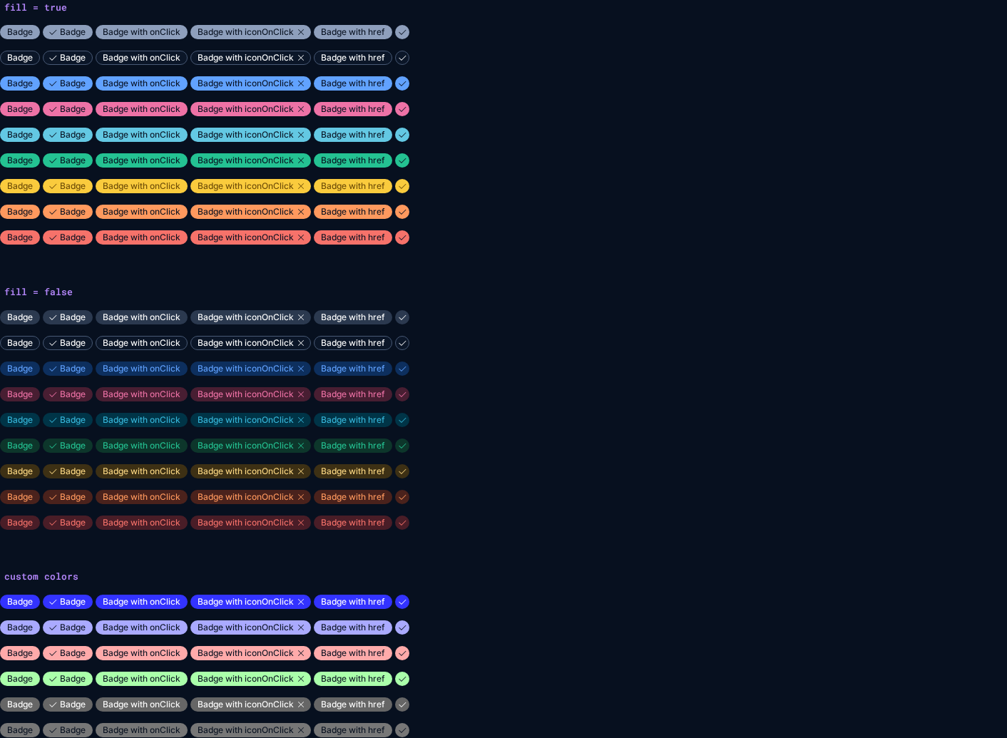
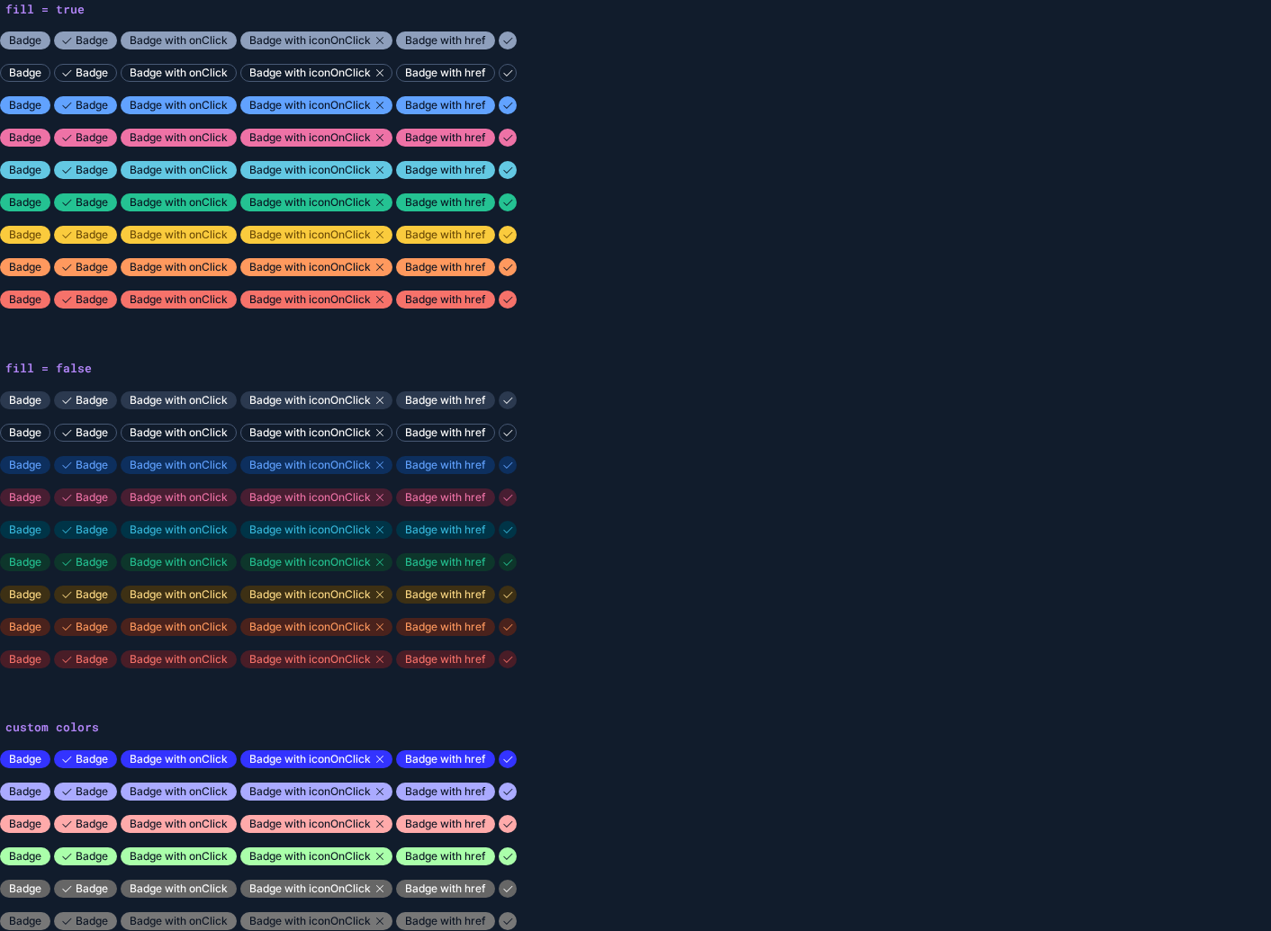
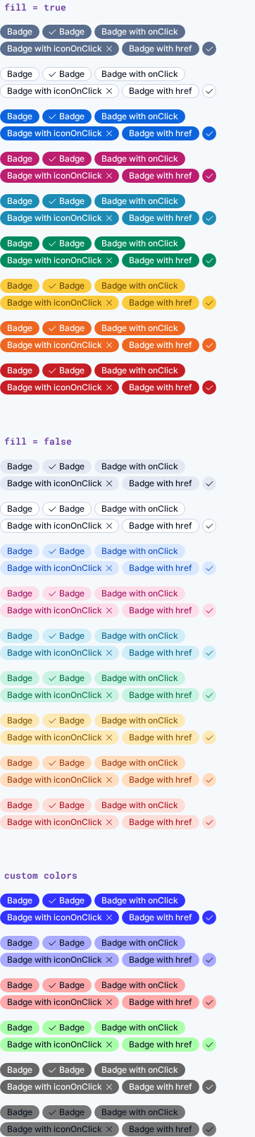
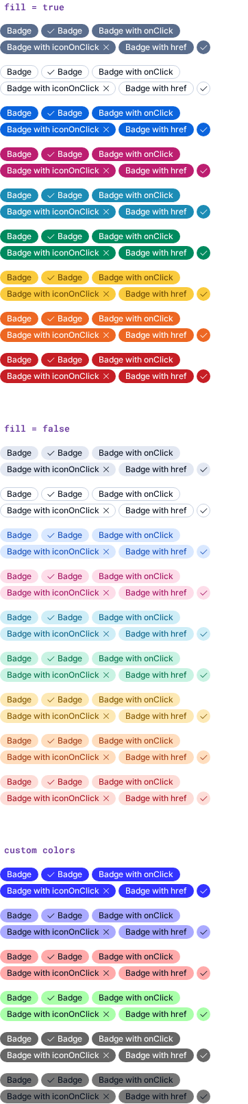
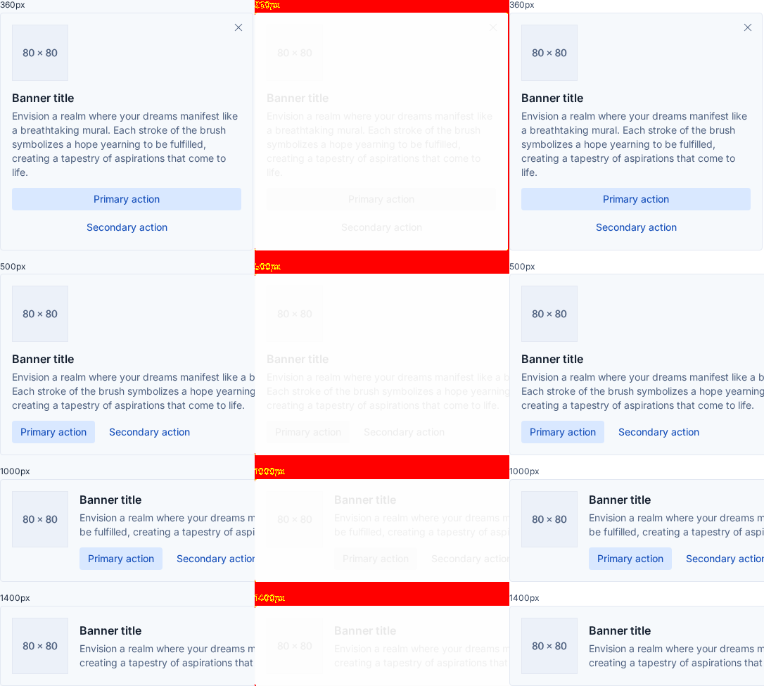
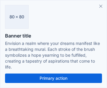
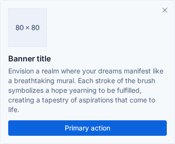
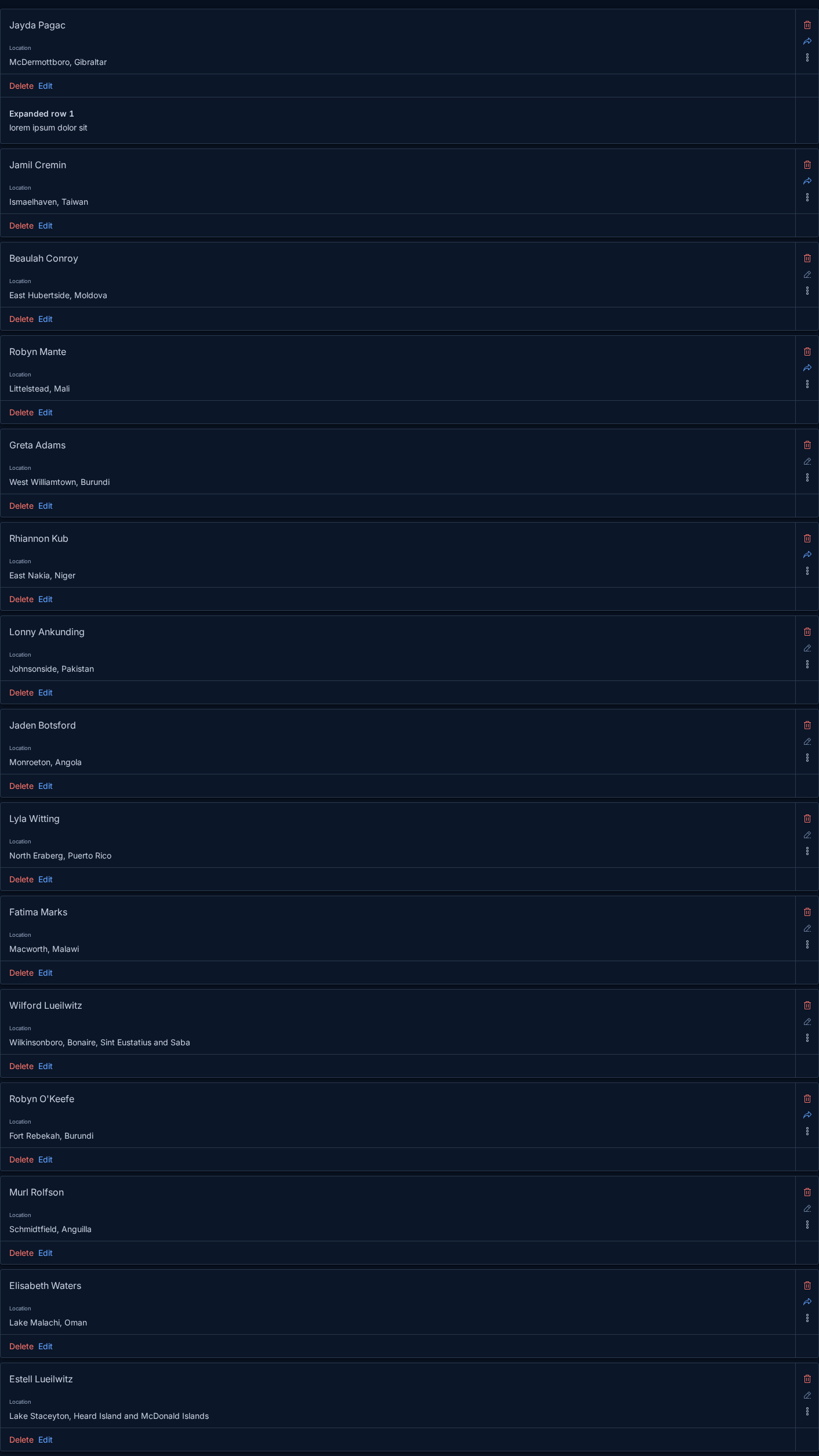
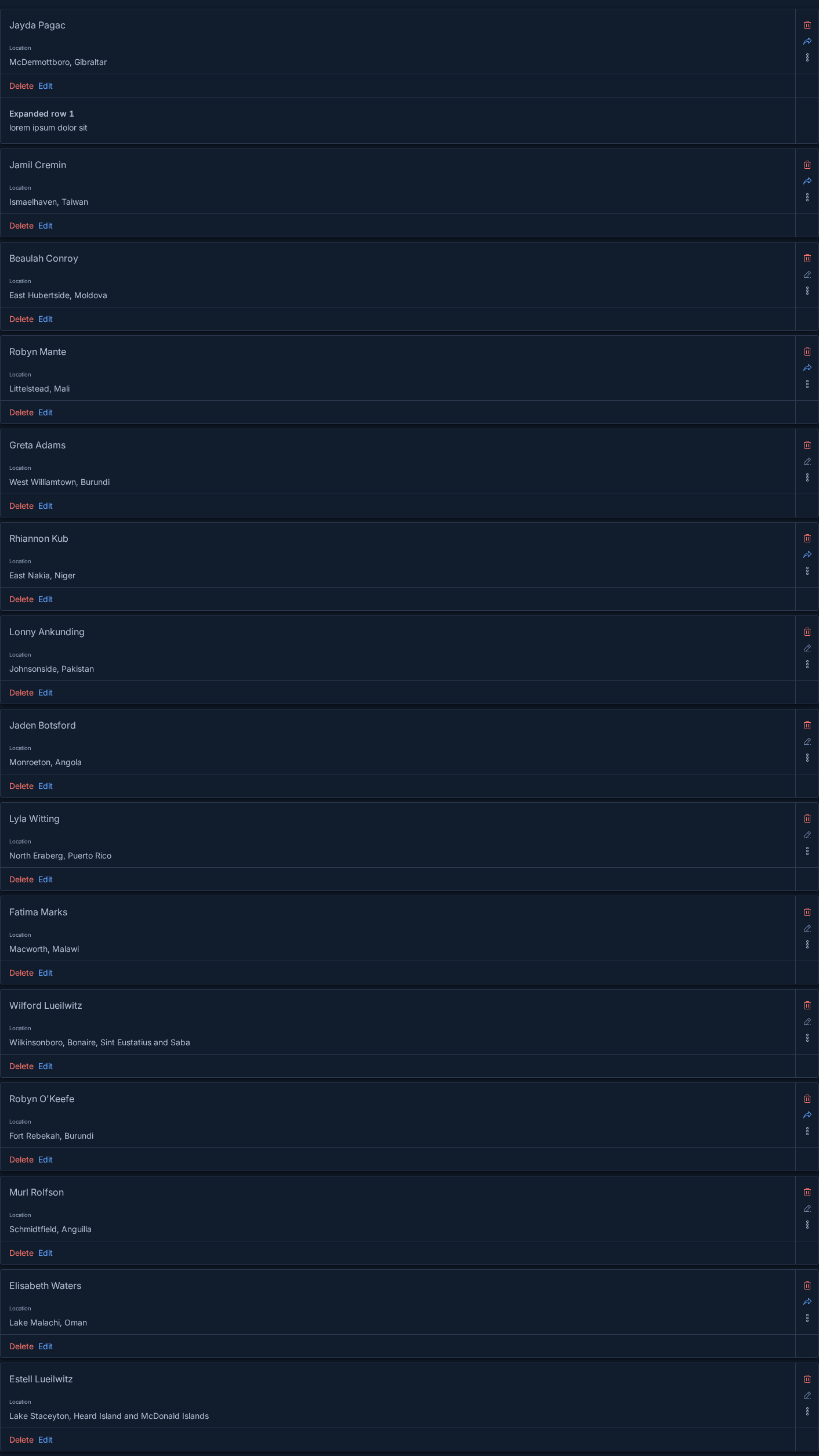
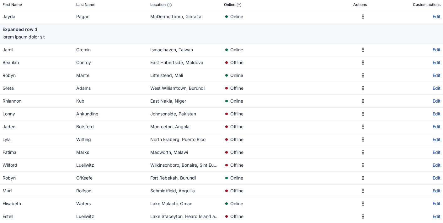
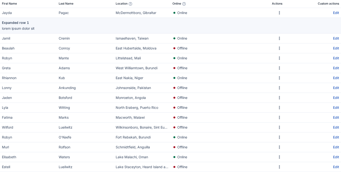
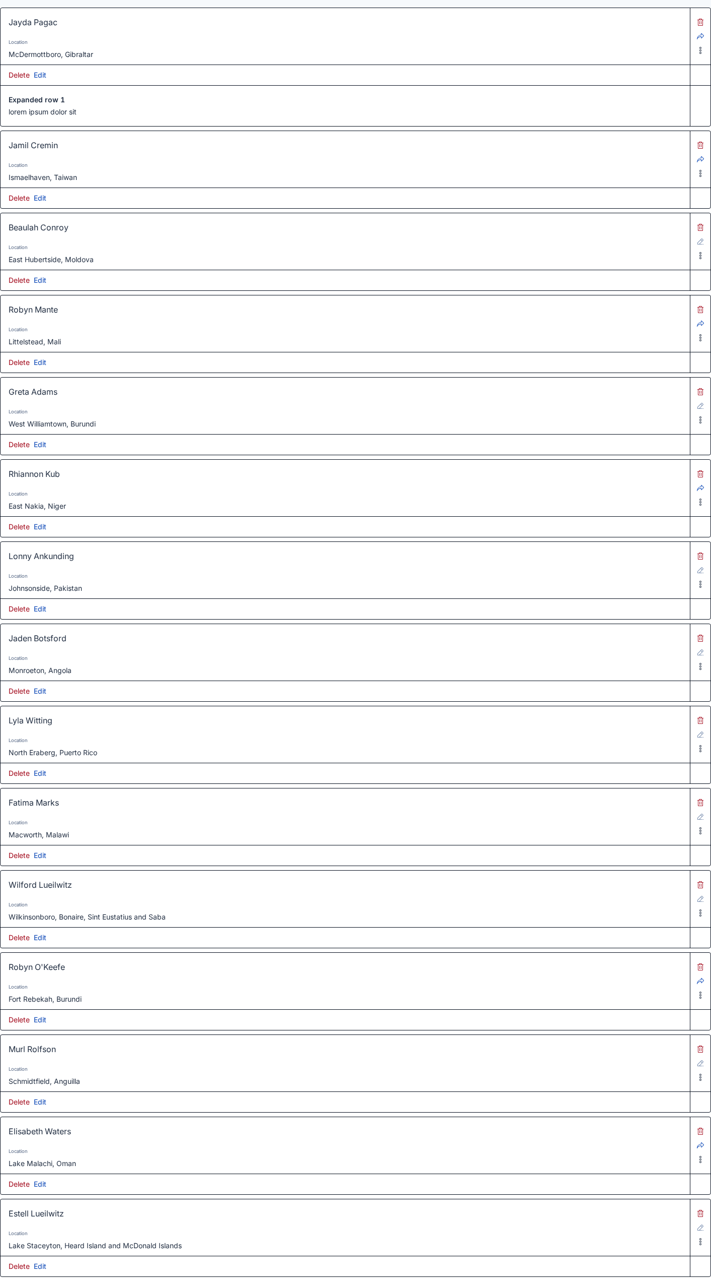
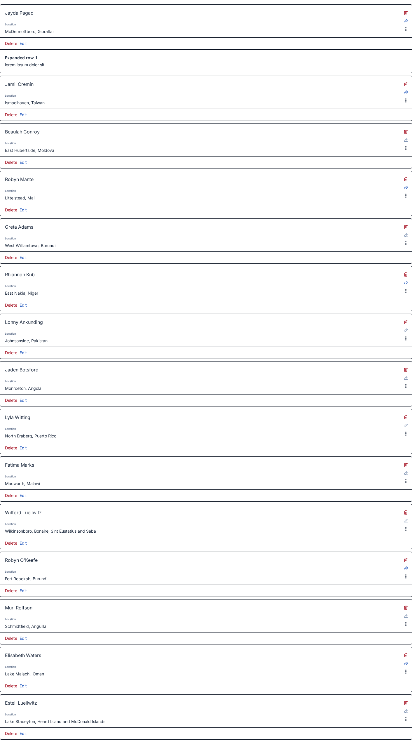
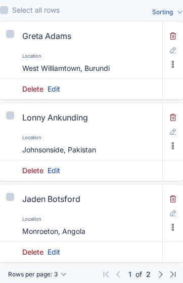
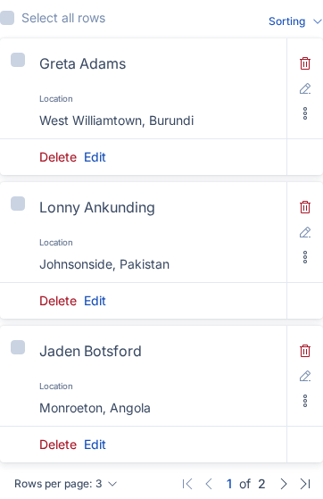
Before After
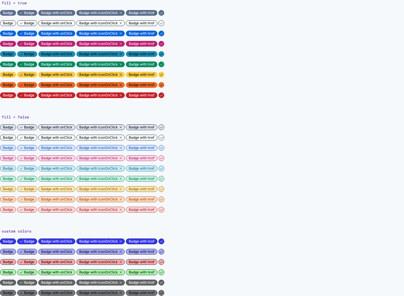
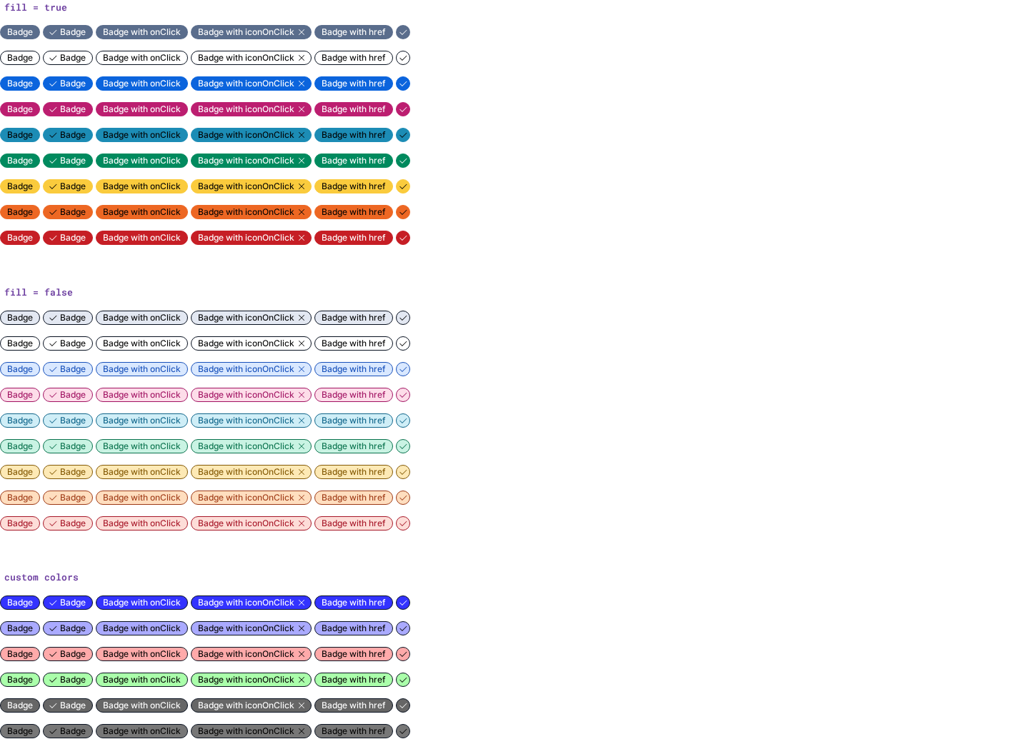
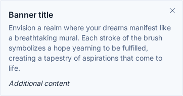
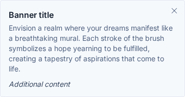
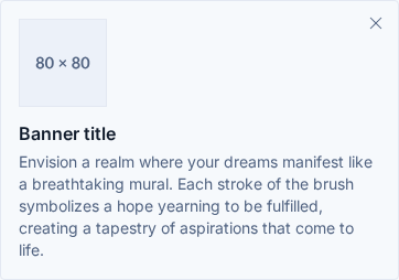
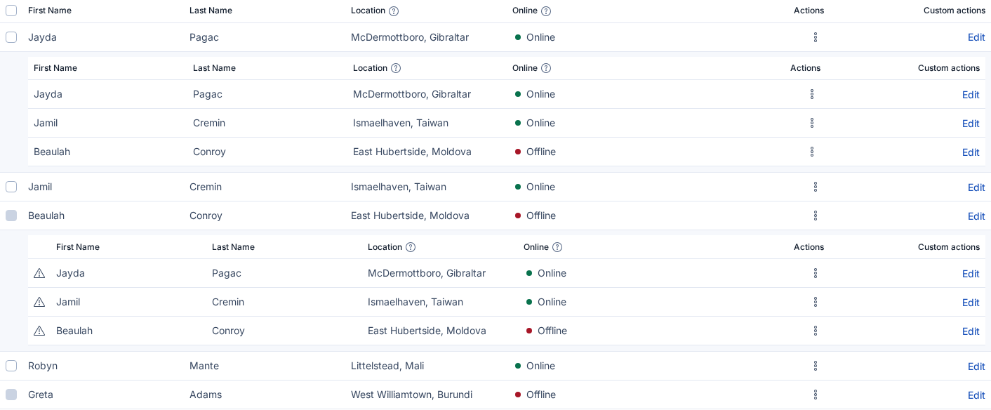
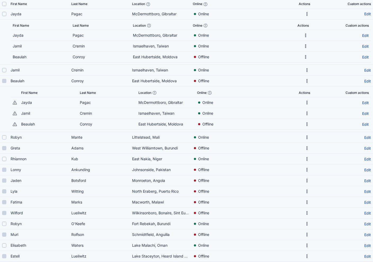
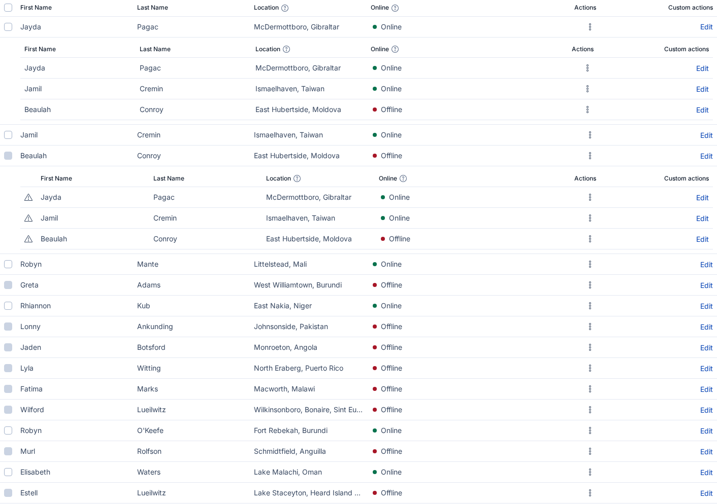
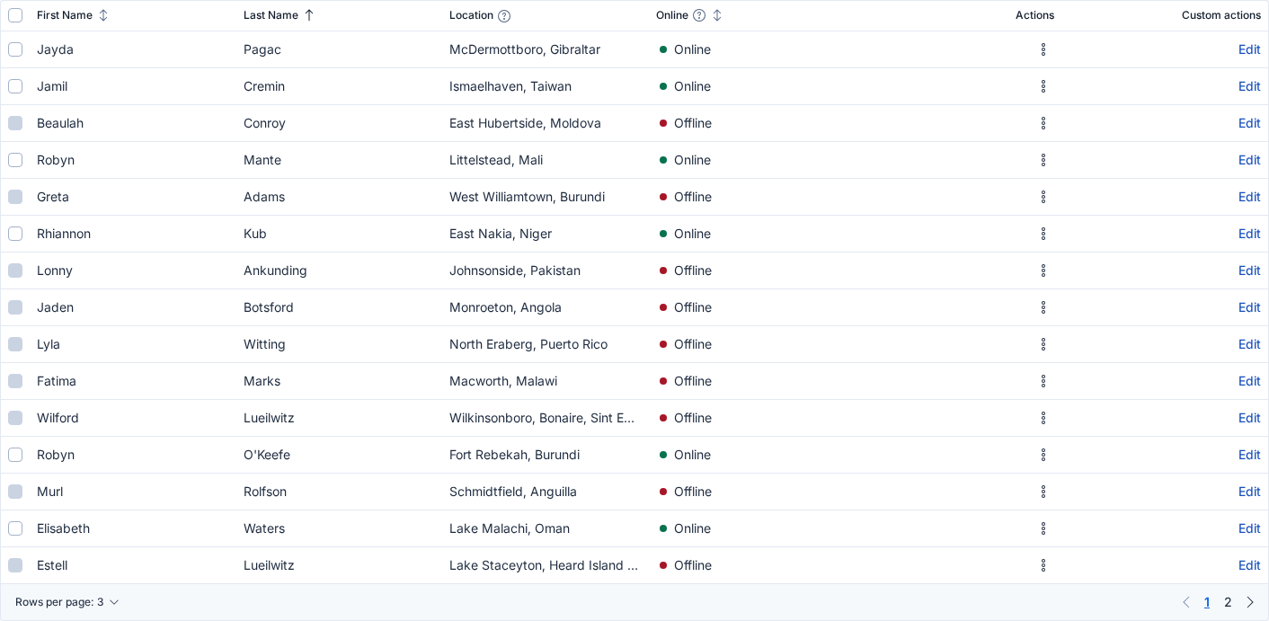
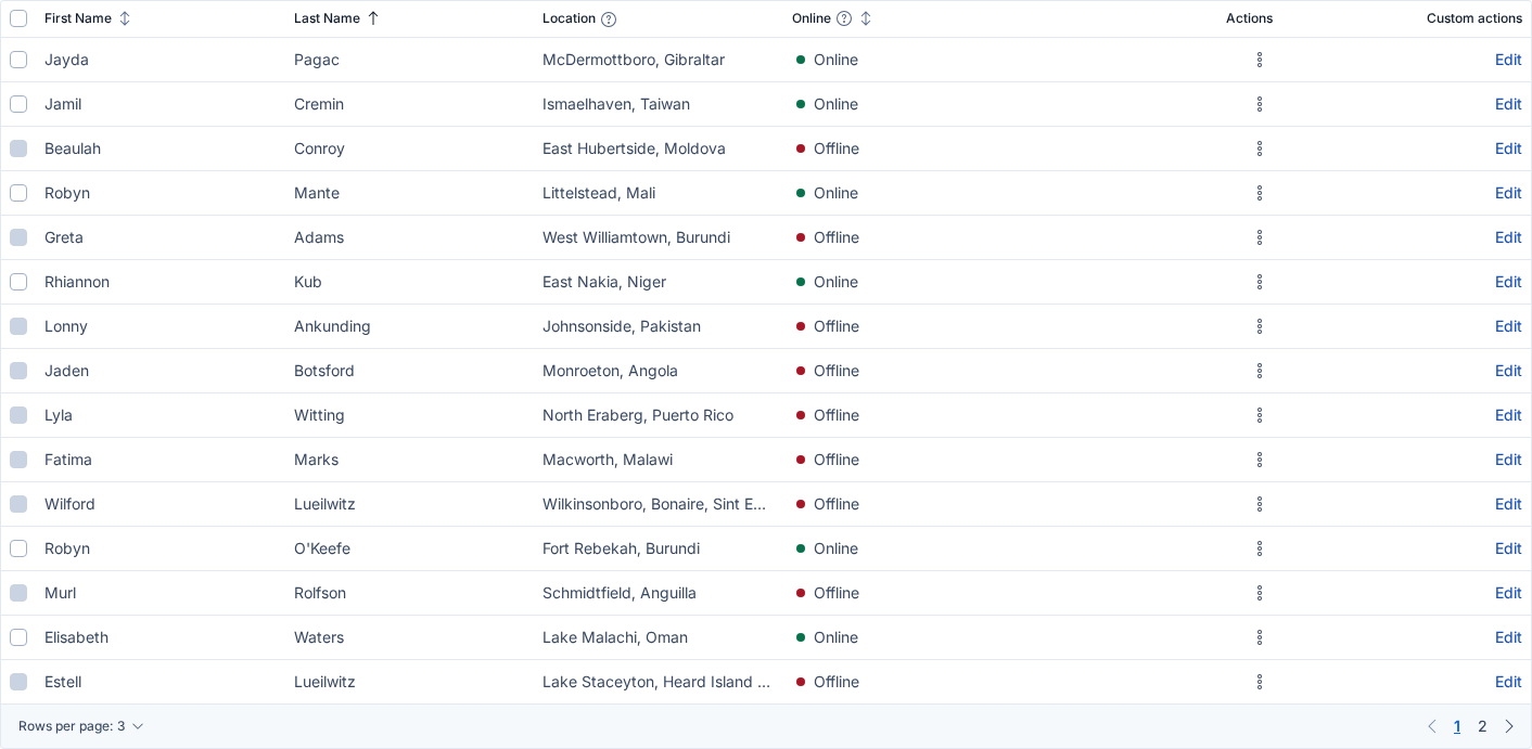
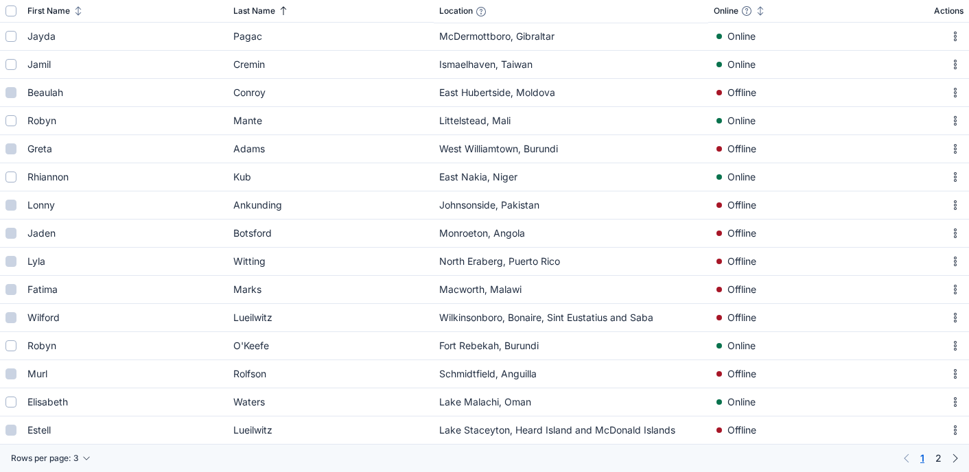
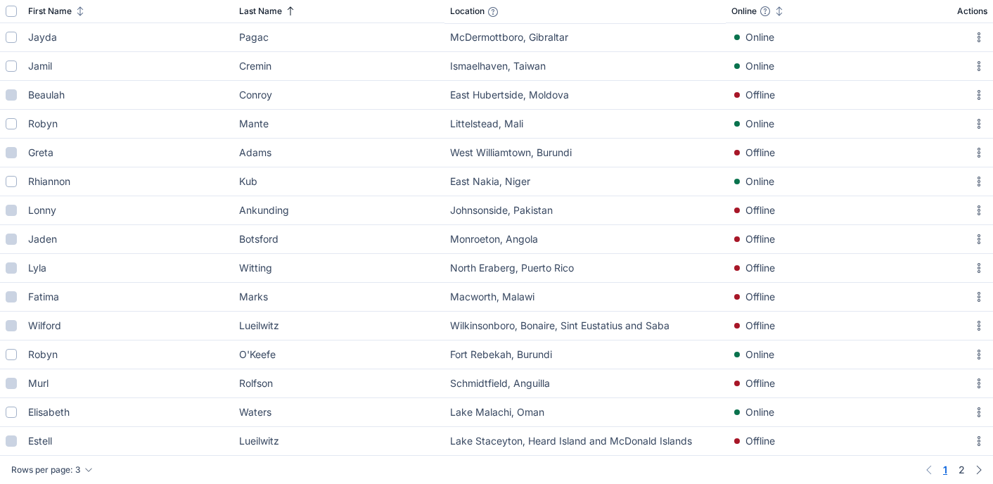
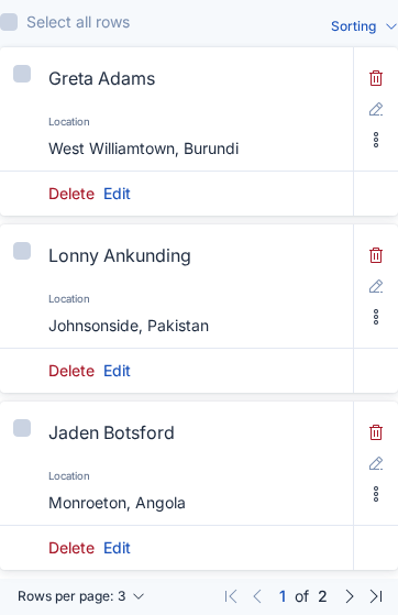
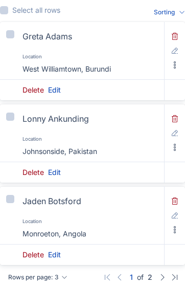
{Before image} {After image}

Impact Assessment

Note: Most PRs should be tested in Kibana to help gauge their Impact before merging.

  • 🔴 Breaking changes — What will break? How many usages in Kibana/Cloud UI are impacted?
  • 💅 Visual changes — May impact style overrides; could require visual testing. Explain and estimate impact.
  • 🧪 Test impact — May break functional or snapshot tests (e.g., HTML structure, class names, default values).
  • 🔧 Hard to integrate — If changes require substantial updates to Kibana, please stage the changes and link them here.

Impact level: 🟢 Low

🧪 The changes have been run in Kibana CI (⏳ build)
Required Kibana changes: commits added here. (test/snapshot updates)

Release Readiness

  • Documentation: eui docs
  • Figma: {link to Figma or issue}
  • Migration guide: {steps or link, for breaking/visual changes or deprecations}
  • Adoption plan (new features): {link to issue/doc or outline who will integrate this and where}

QA instructions for reviewer

  • verify token values match design input by @ryankeairns
  • verify all token values across different outputs have been correctly updated (JS, SCSS, JSON)
  • verify docs updates are correct

Checklist before marking Ready for Review

Reviewer checklist

  • Approved Impact Assessment — Acceptable to merge given the consumer impact.
  • Approved Release Readiness — Docs, Figma, and migration info are sufficient to ship.

@mgadewoll mgadewoll self-assigned this Aug 28, 2026
@github-actions github-actions Bot added the community contribution (Don't delete - used for automation) label Aug 28, 2026
@mgadewoll mgadewoll removed the community contribution (Don't delete - used for automation) label Aug 28, 2026
@elastic elastic deleted a comment from github-actions Bot Aug 28, 2026
@mgadewoll
mgadewoll changed the base branch from main to feat/calm-down-redesign August 28, 2026 15:29
@mgadewoll
mgadewoll force-pushed the calm-down/token-changes branch from da3c200 to c20d9d8 Compare August 31, 2026 08:55
@elastic-vault-github-plugin-prod

Copy link
Copy Markdown

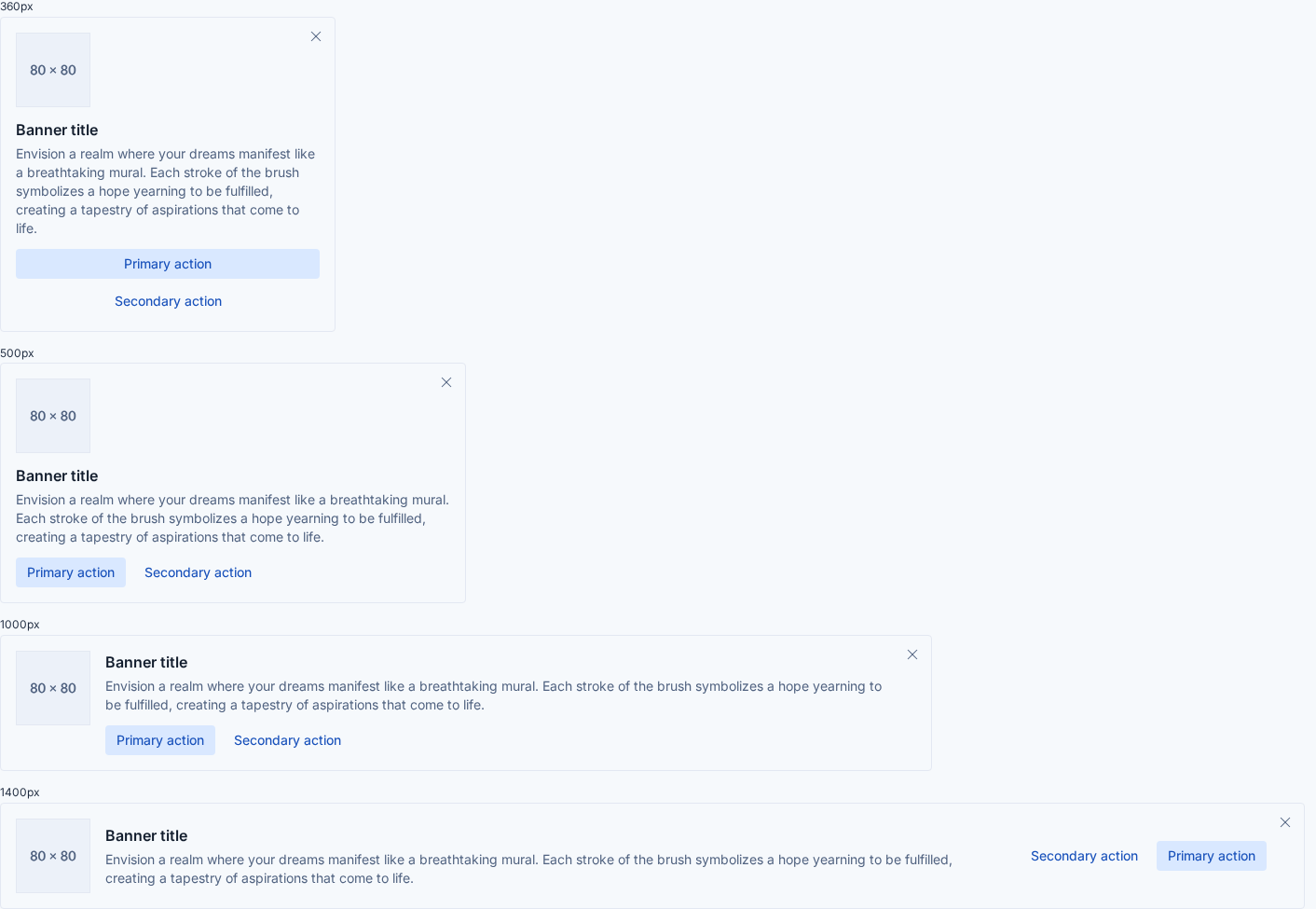
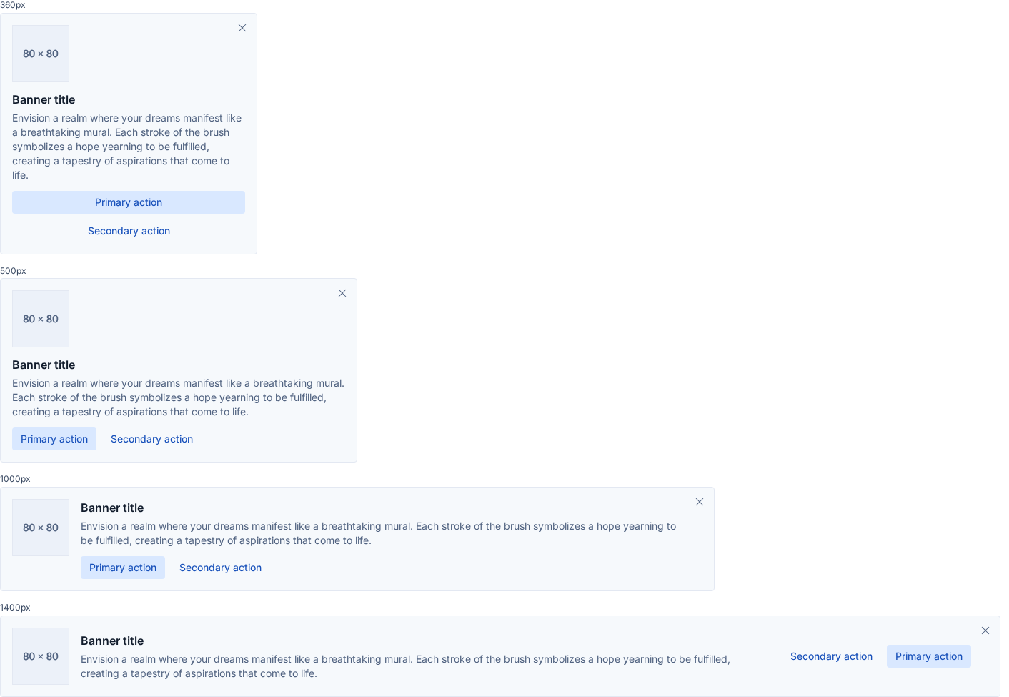
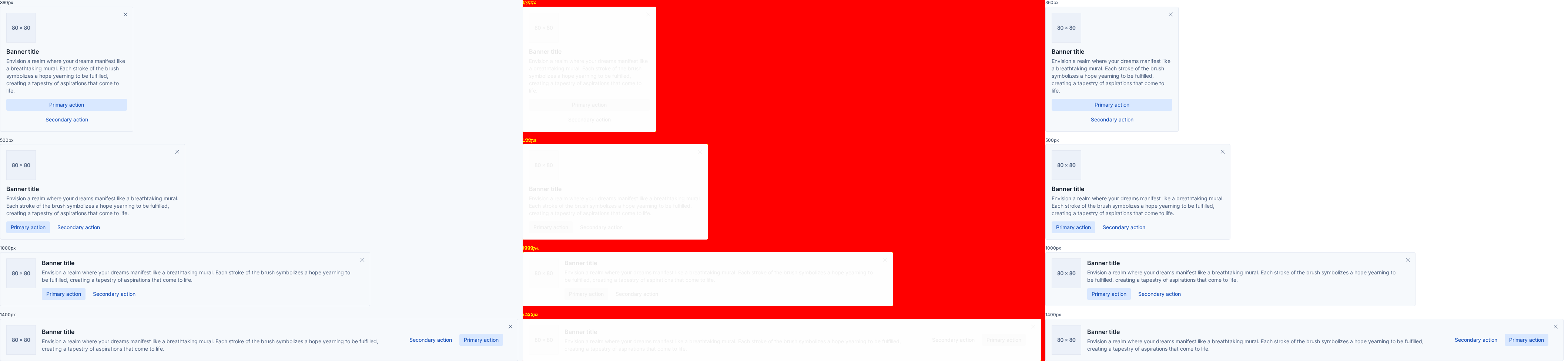
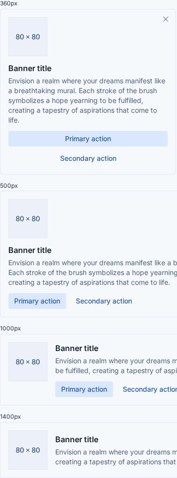
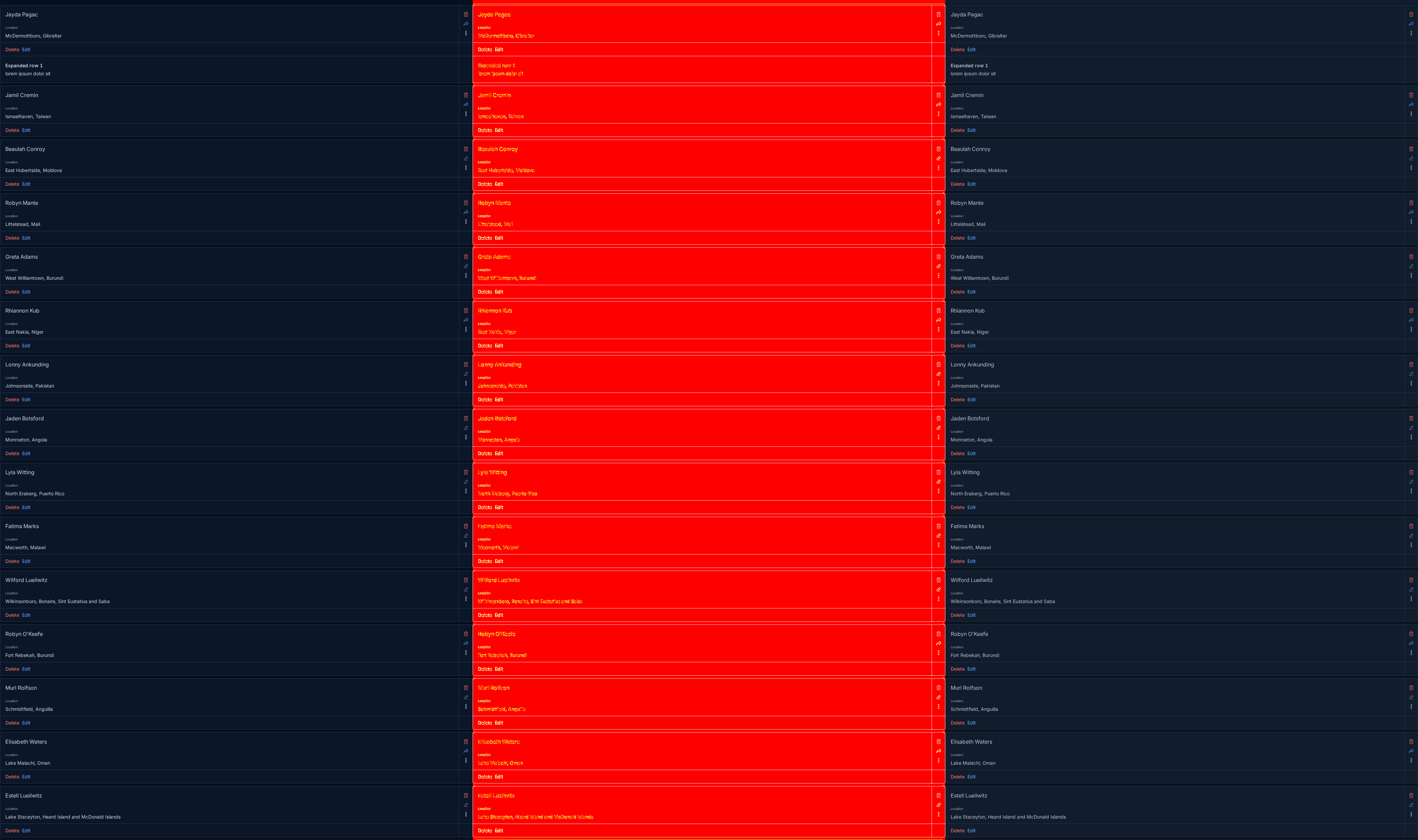
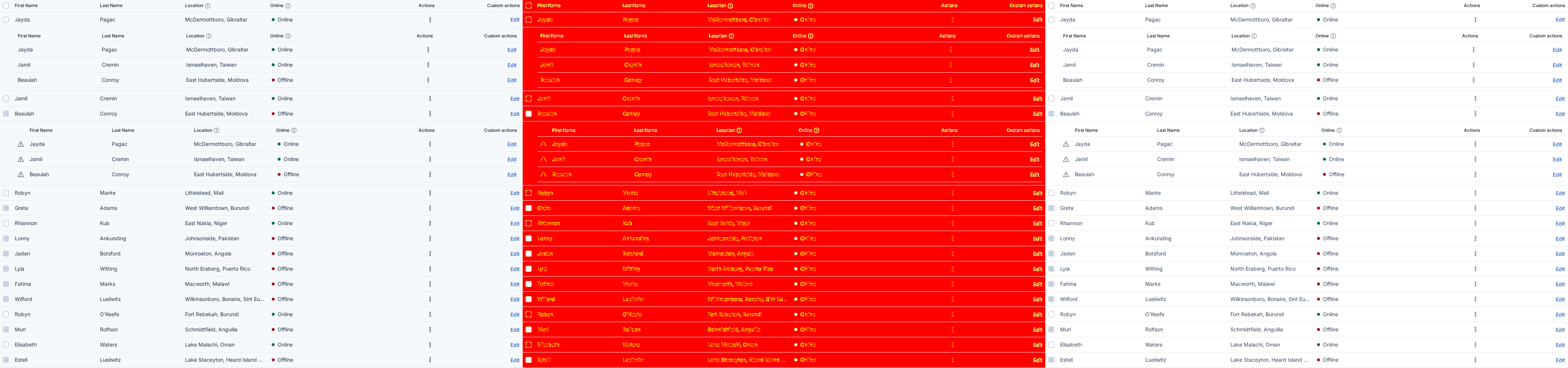
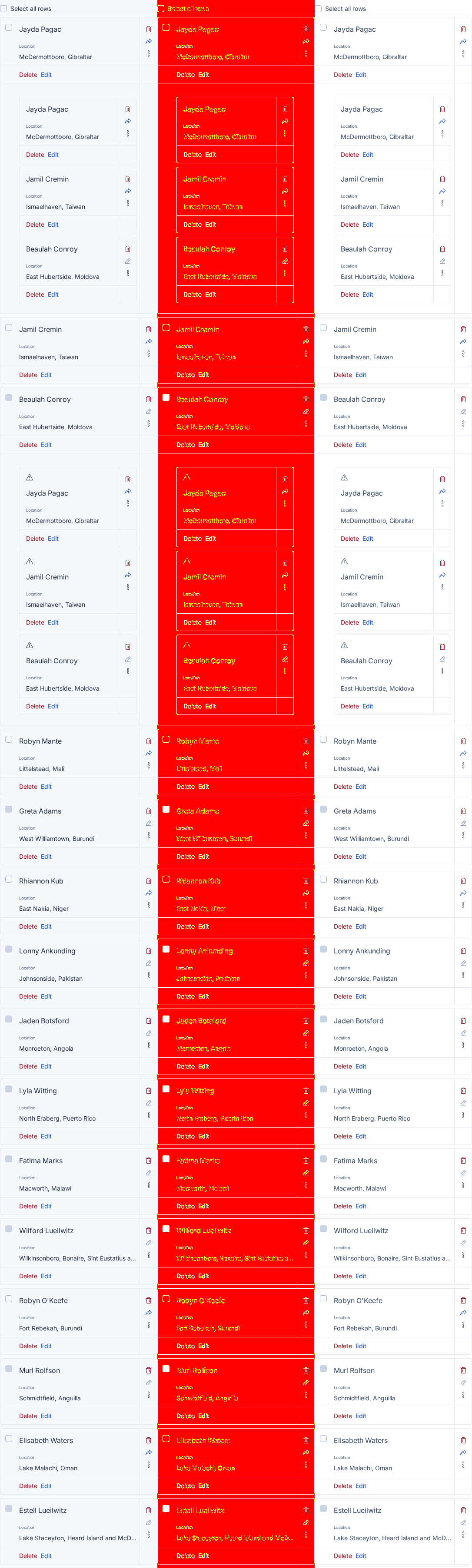
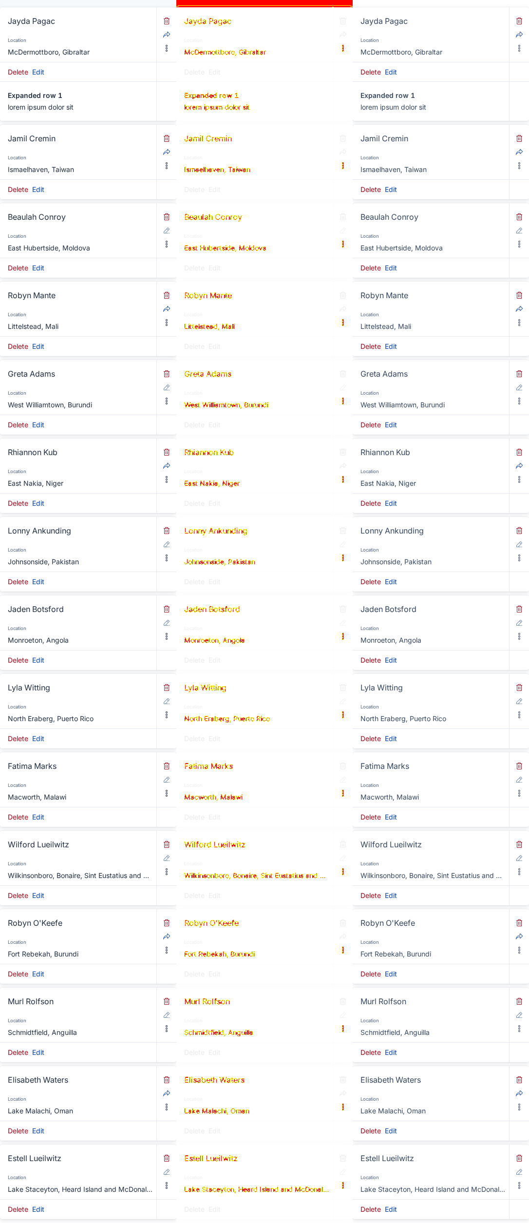
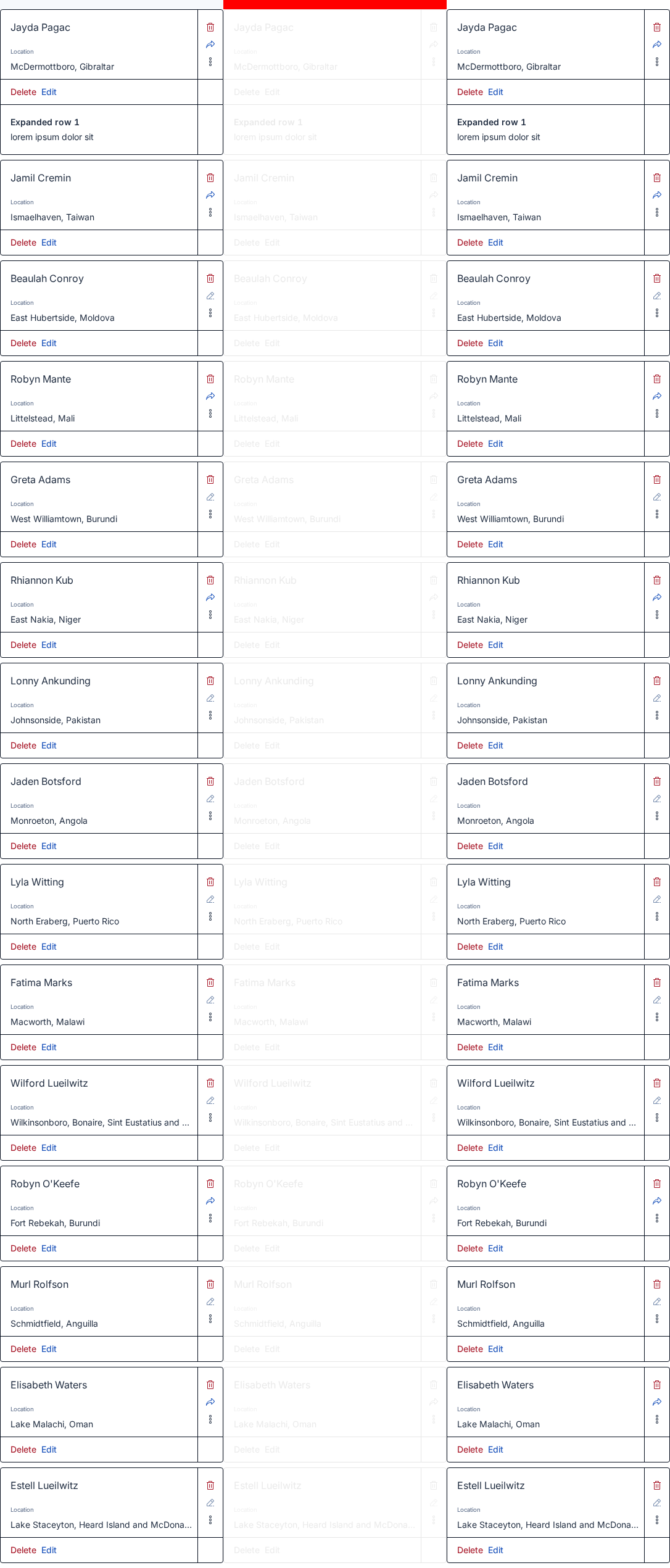
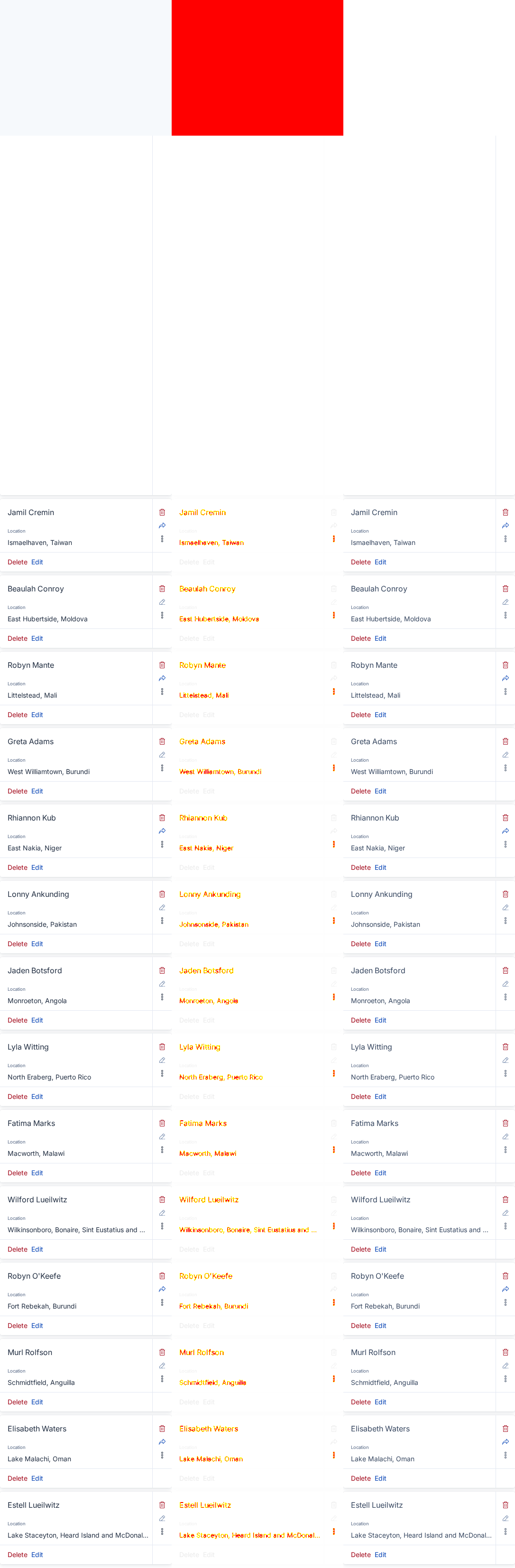
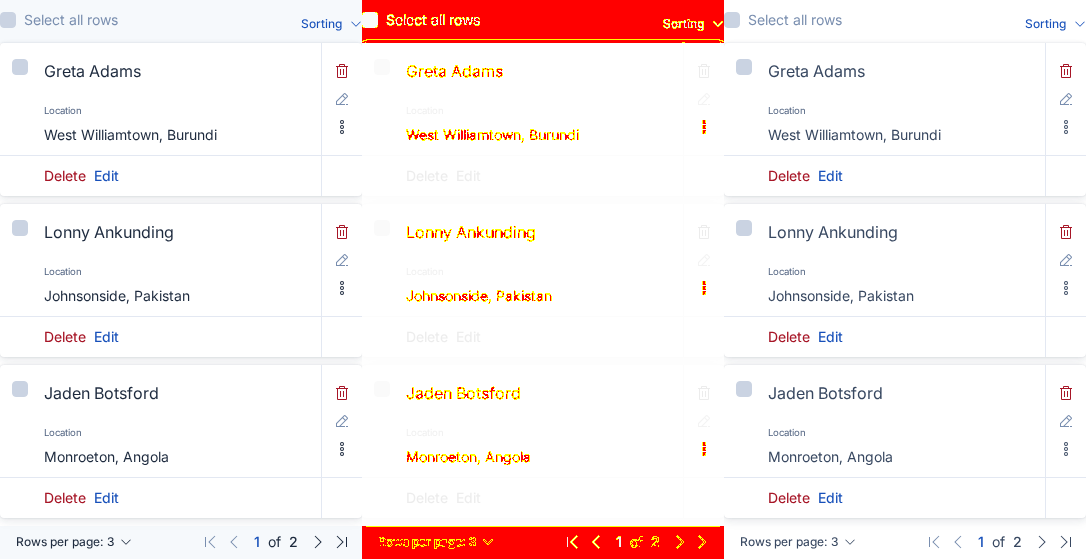
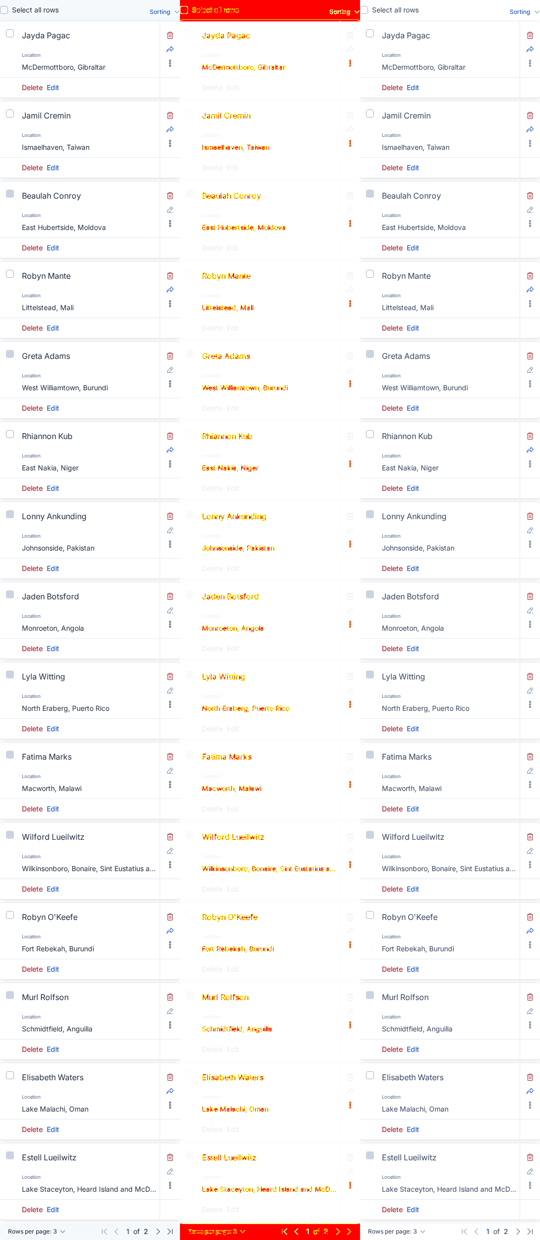
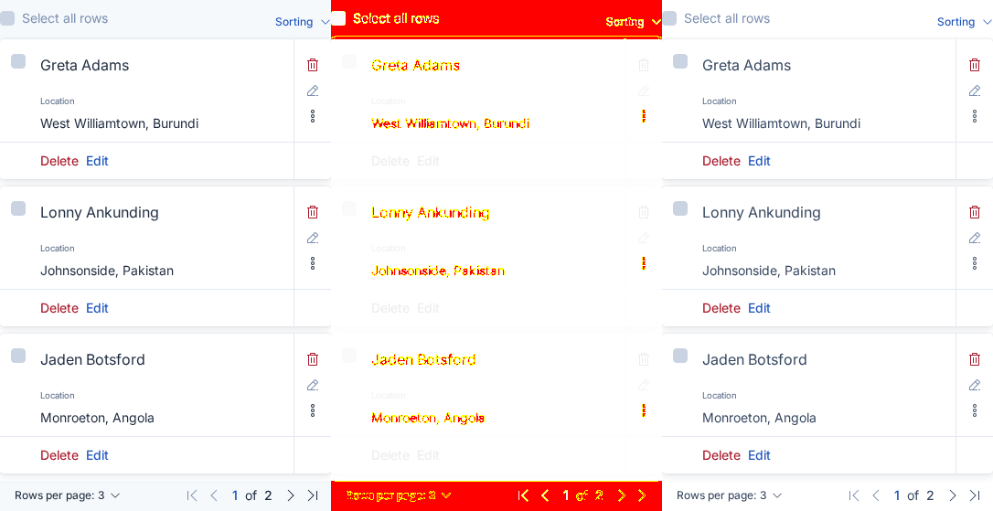
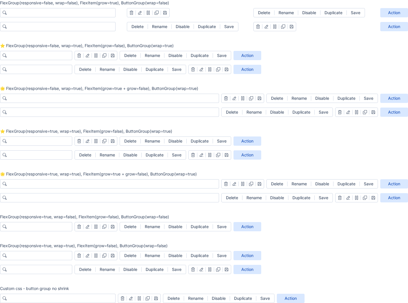
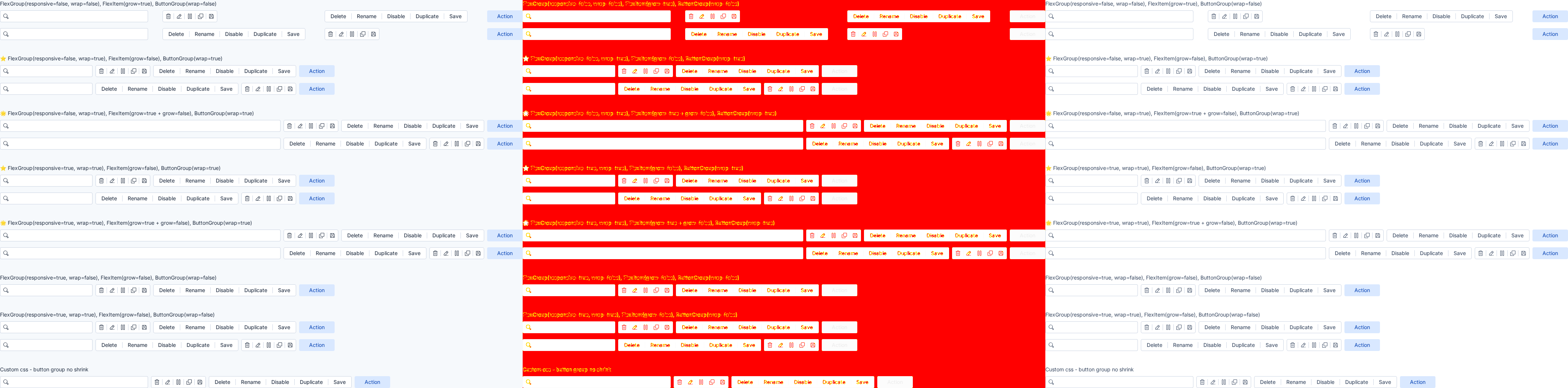
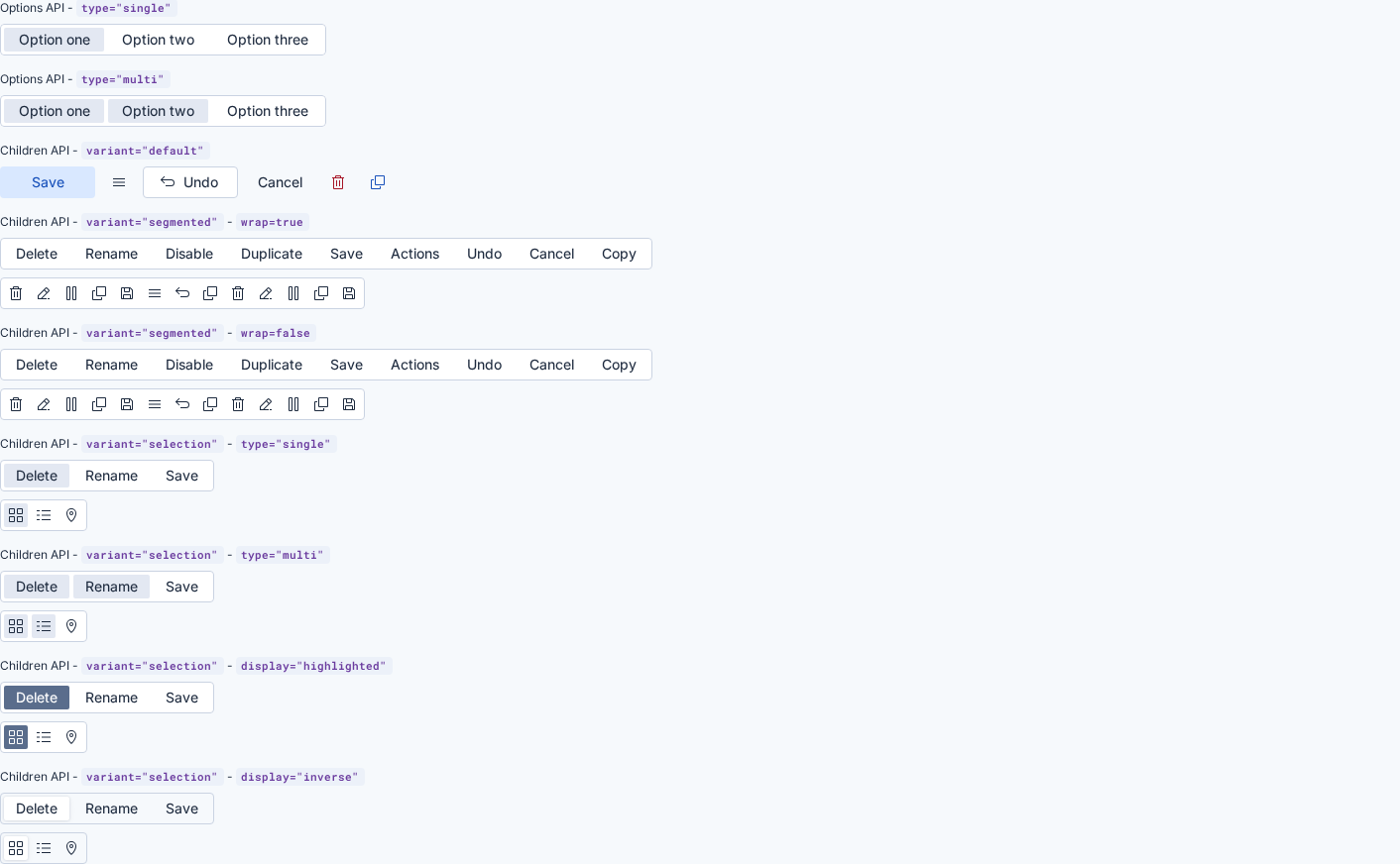
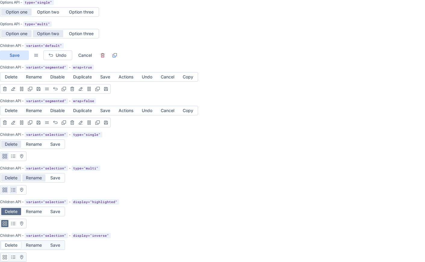
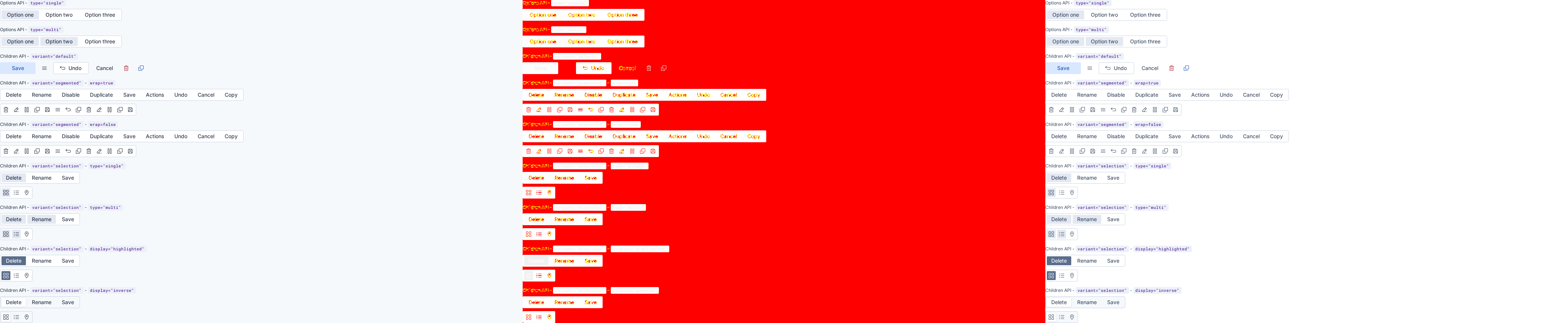
📷 1075 visual difference(s) found

Look at the visual diff below. If everything is expected, run Approve visual changes to update baselines, re-run the job or make appropriate fixes.

See the visual regression testing wiki for more information.

Expand to review

euiaccordion (2 differences)

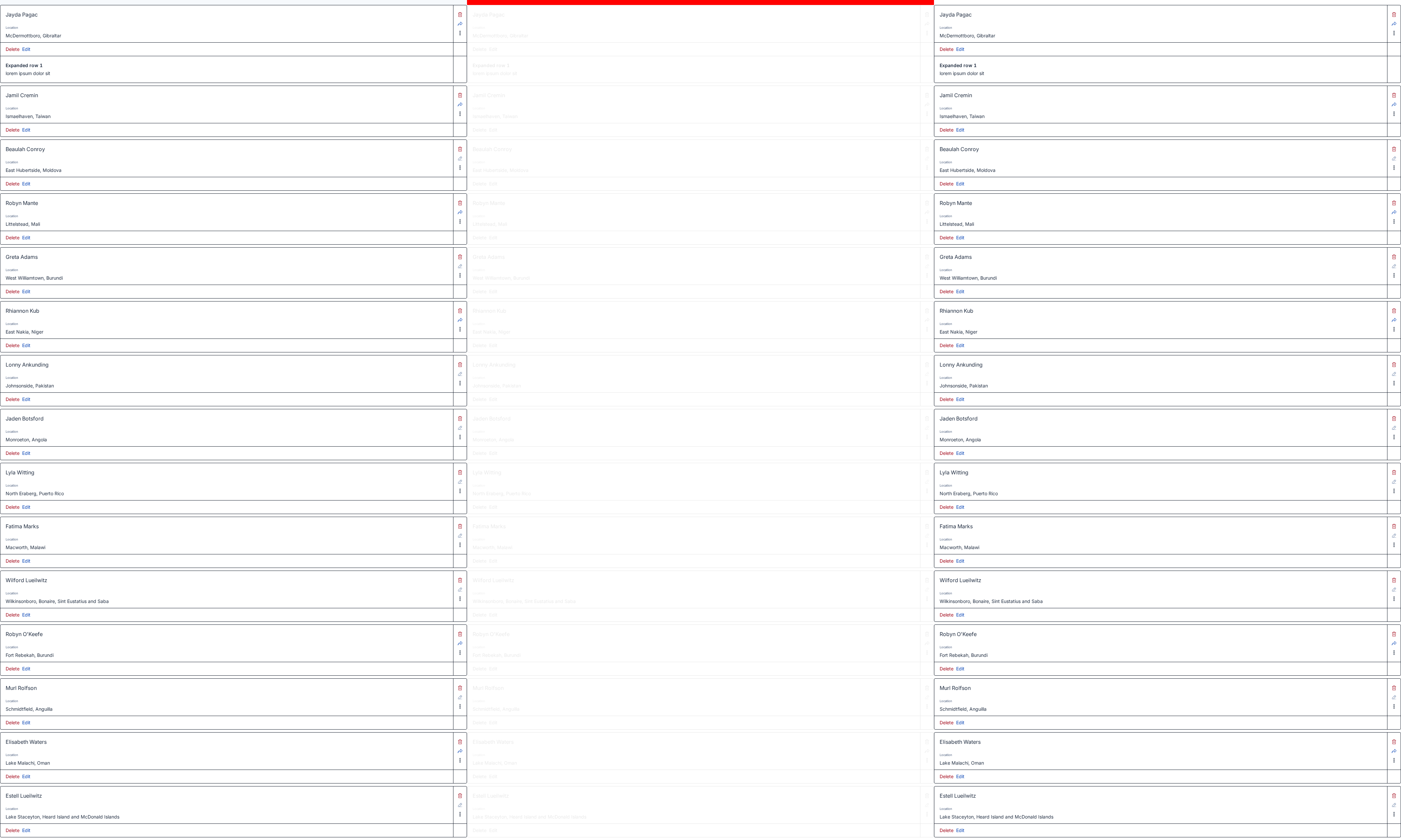
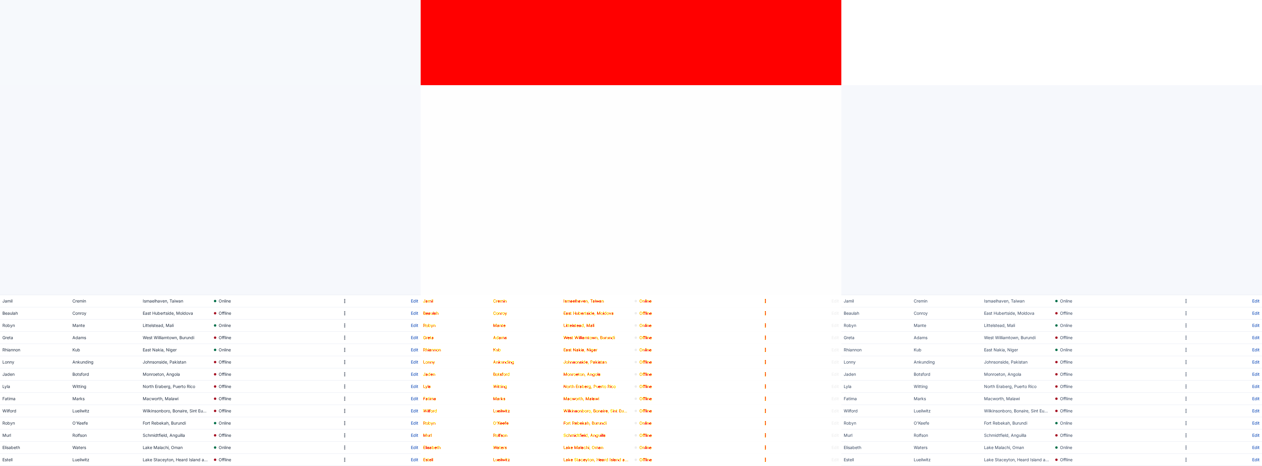
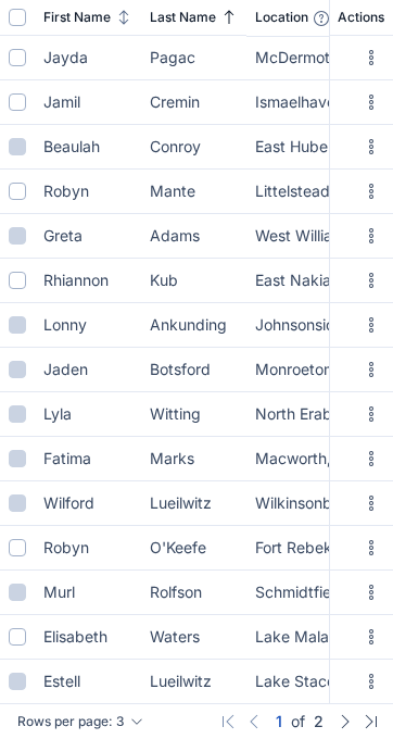
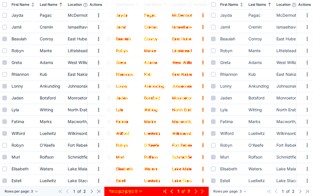
StoryDiff %BeforeAfterDiff
playground desktop 98.04%
playground mobile 92.37%

euiaspectratio (2 differences)

StoryDiff %BeforeAfterDiff
playground desktop 0.16%
playground mobile 0.49%

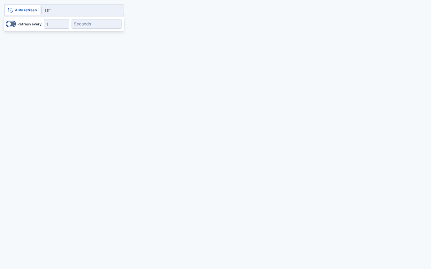
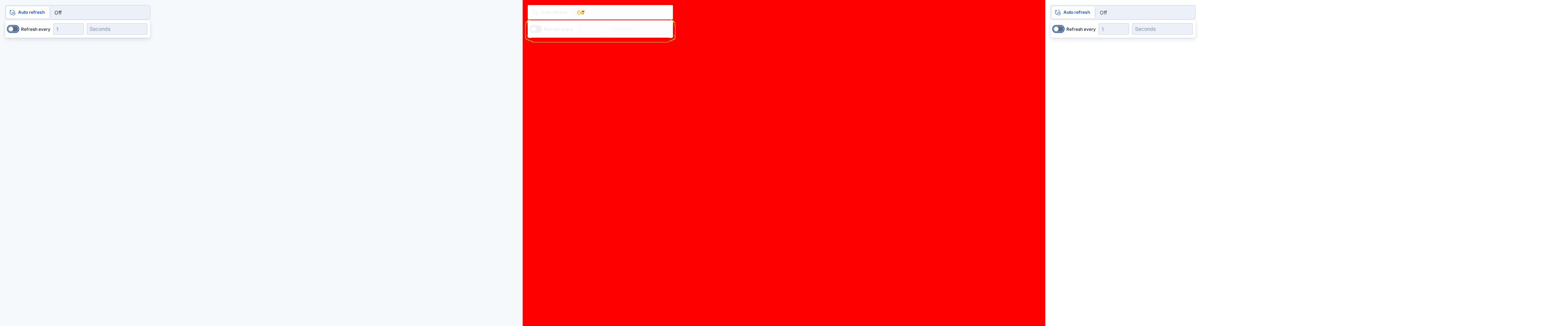
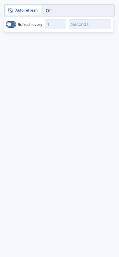
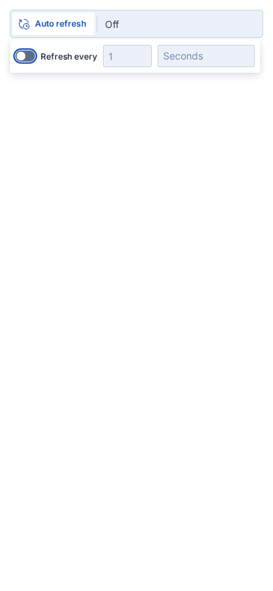
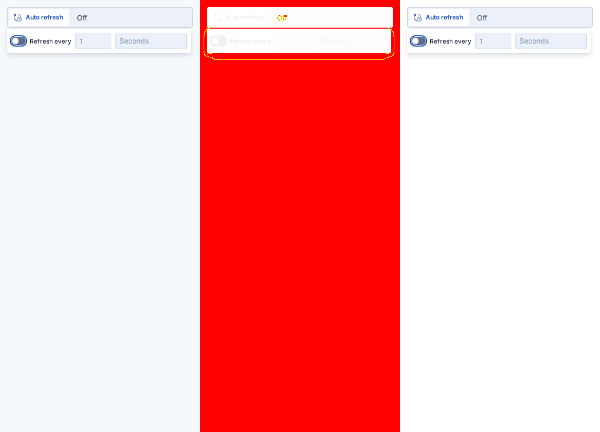
euiautorefresh (4 differences)

StoryDiff %BeforeAfterDiff
playground desktop 97.24%
playground desktop 91.65%
playground mobile 90.23%
playground mobile 91.65%

euiautosizer (2 differences)

StoryDiff %BeforeAfterDiff
playground desktop 0.02%
playground mobile 0.09%

euiavatar (2 differences)

StoryDiff %BeforeAfterDiff
playground desktop 16.41%
playground mobile 16.41%

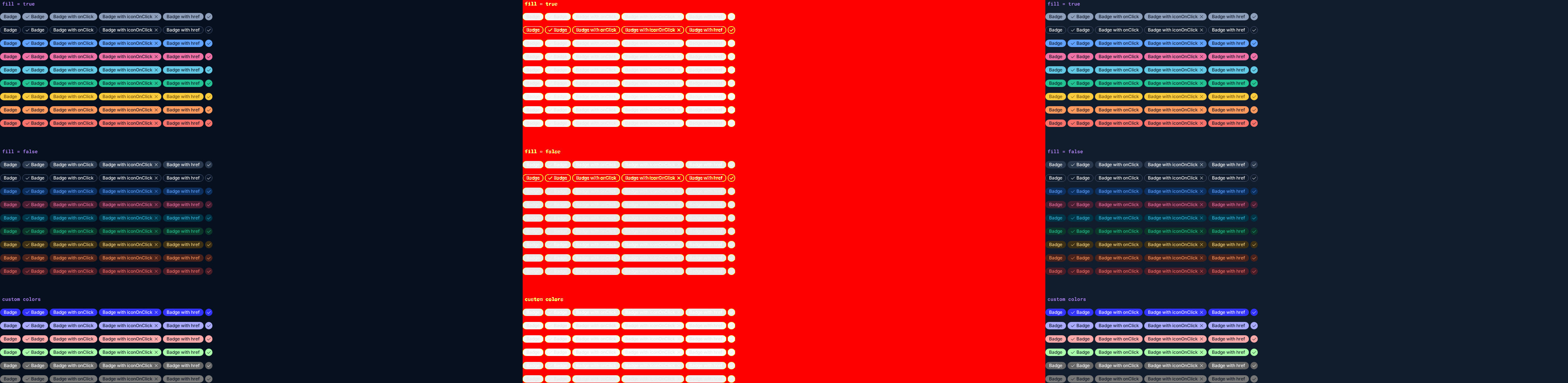
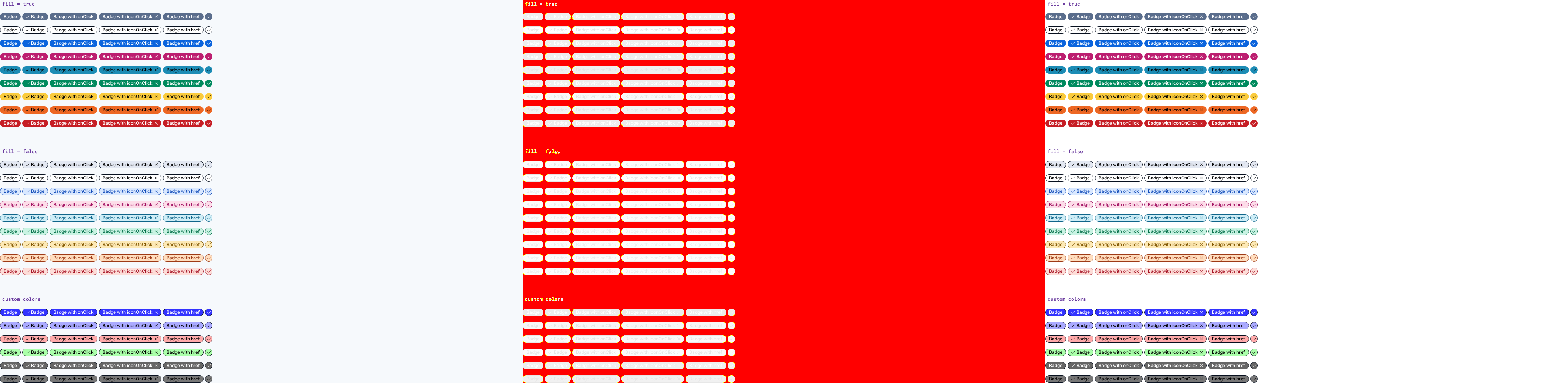
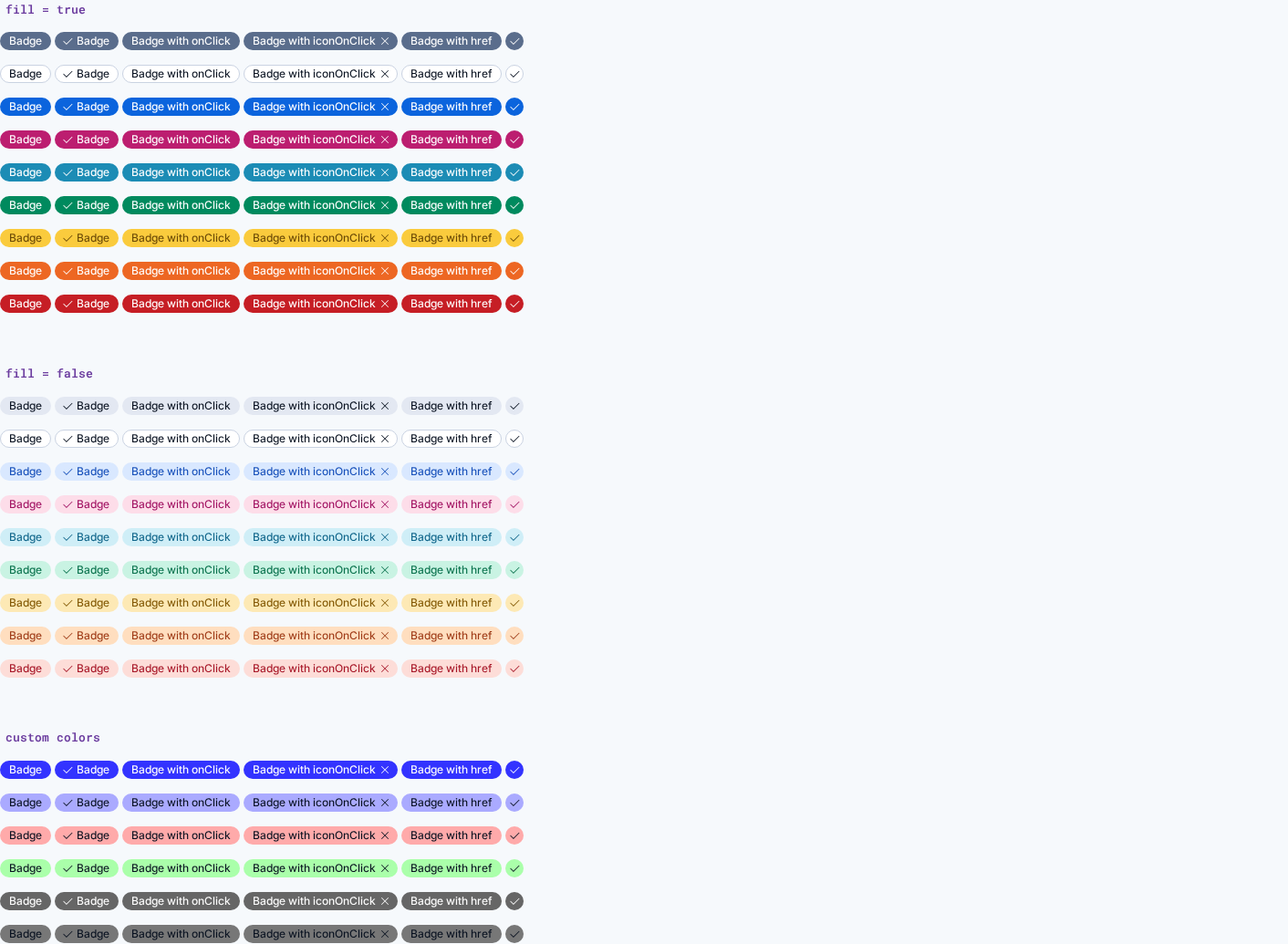
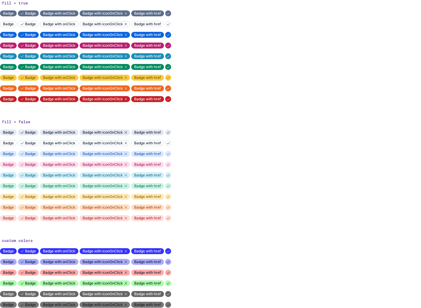
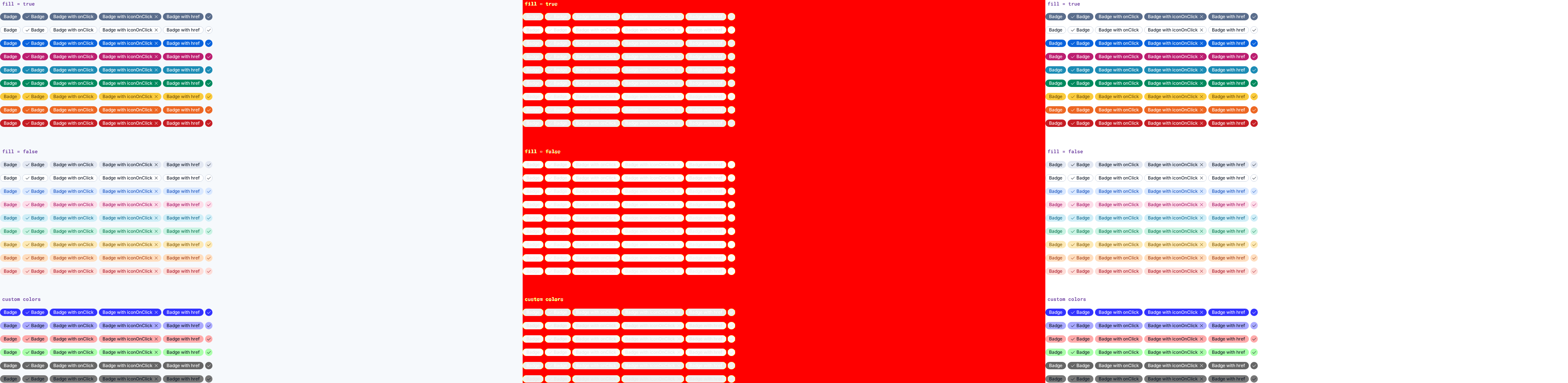
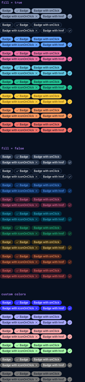
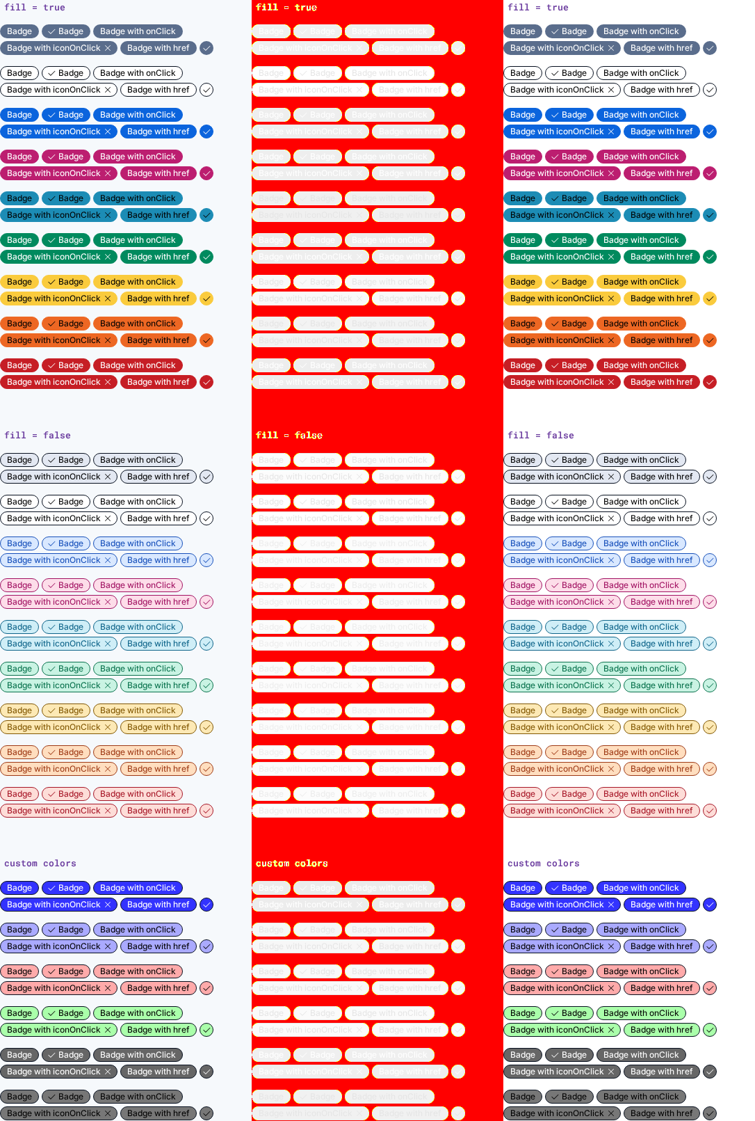
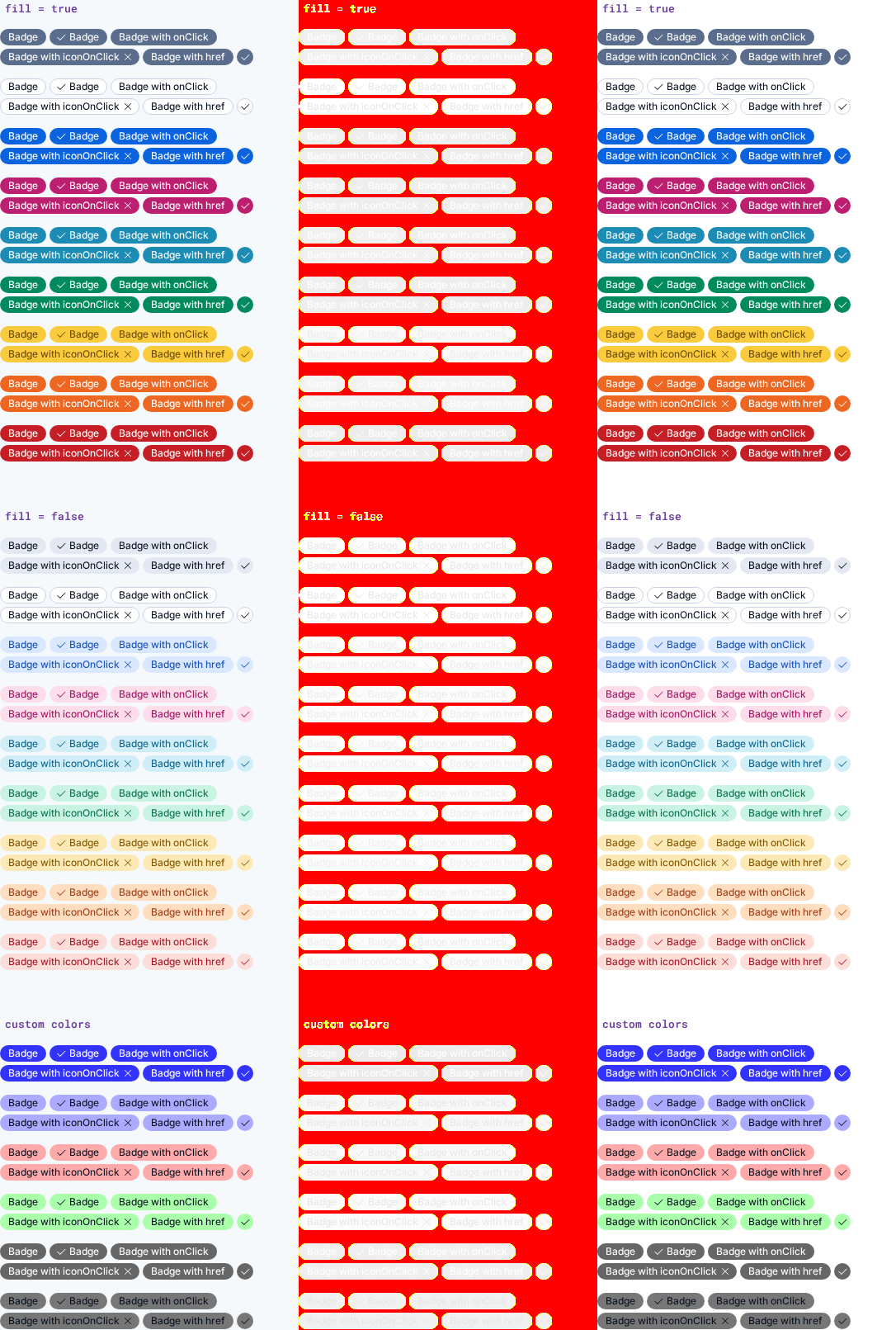
euibadge (12 differences)

StoryDiff %BeforeAfterDiff
custom colors desktop 3.95%
dark mode desktop 83.35%
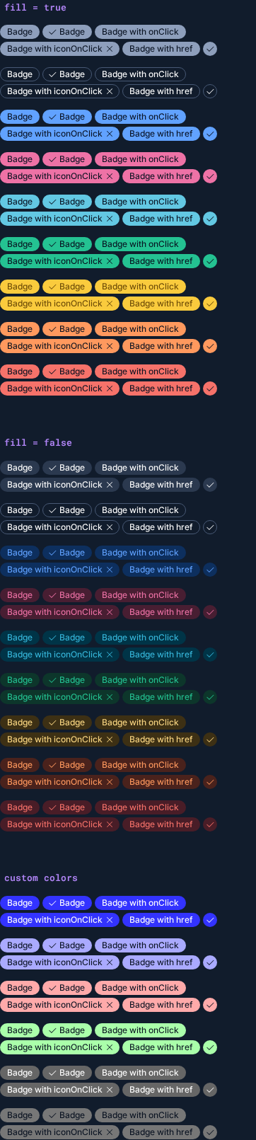
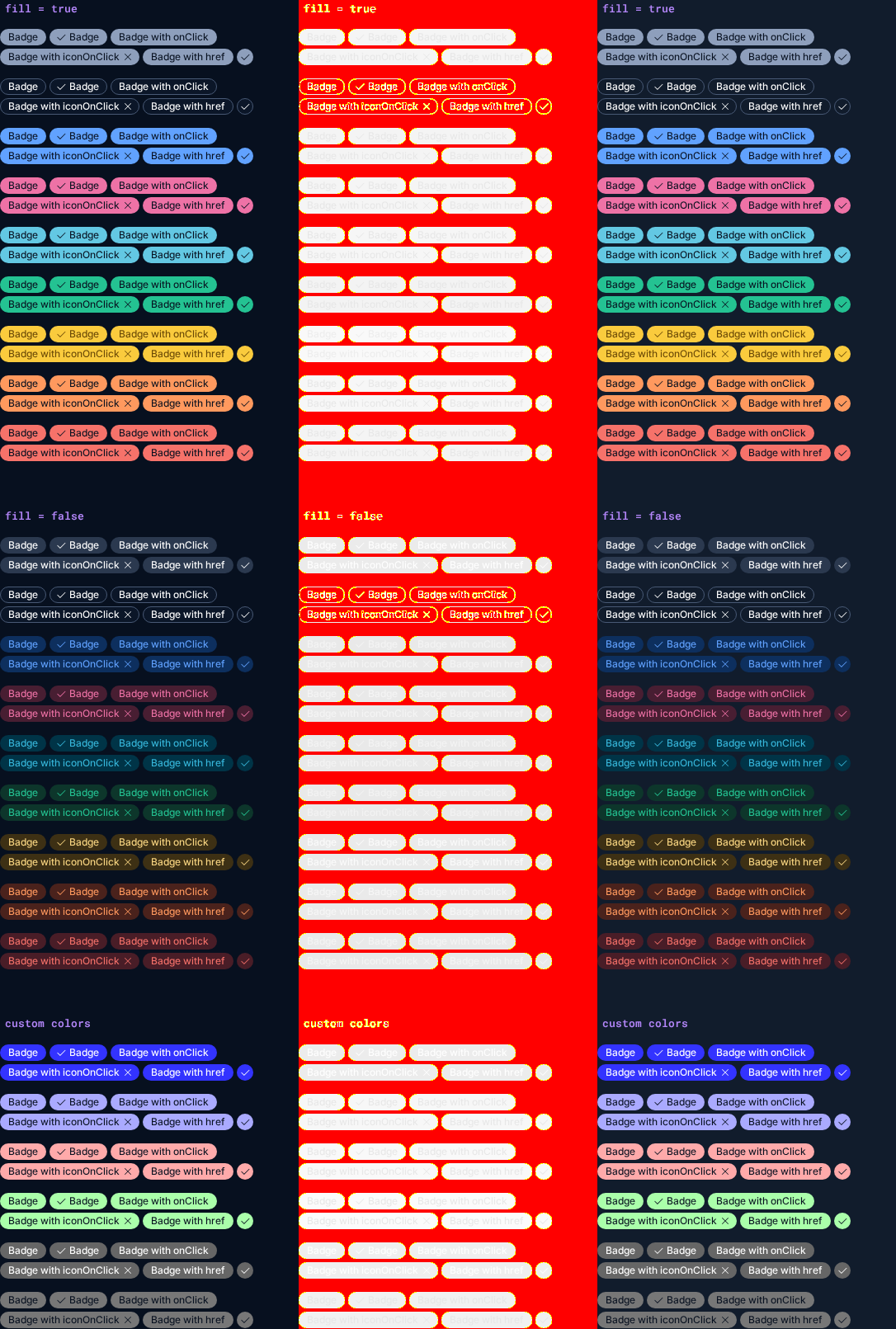
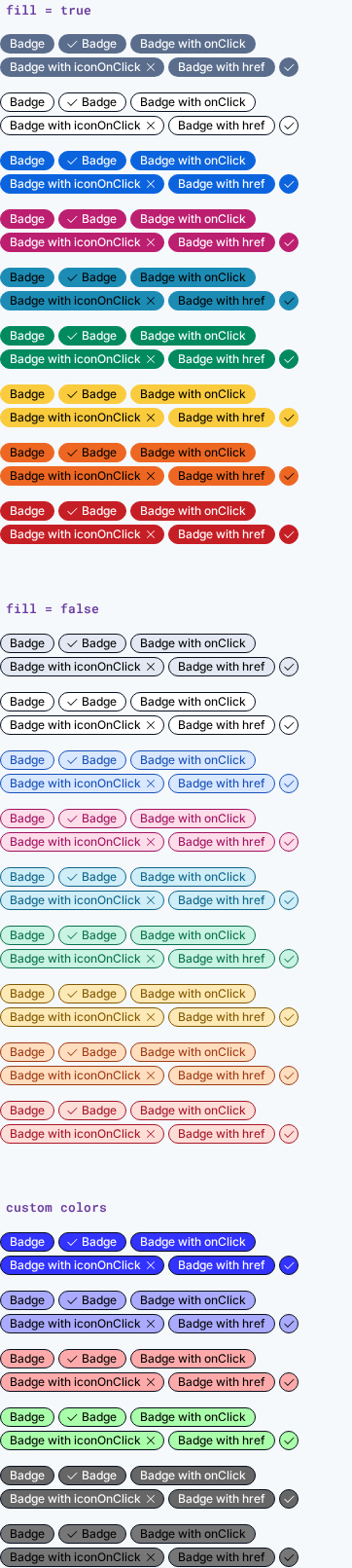
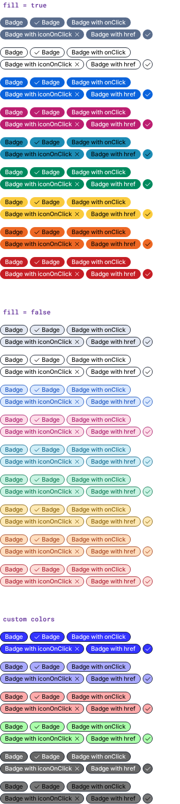
high contrast mode desktop 82.40%
kitchen sink desktop 82.36%
playground desktop 4.07%
playground desktop 10.17%
custom colors mobile 3.95%
dark mode mobile 58.29%
high contrast mode mobile 55.91%
kitchen sink mobile 55.81%
playground mobile 4.07%
playground mobile 10.17%

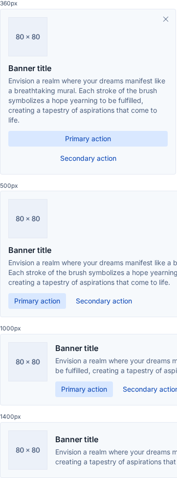
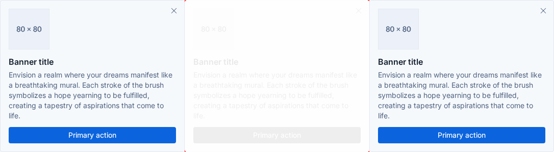
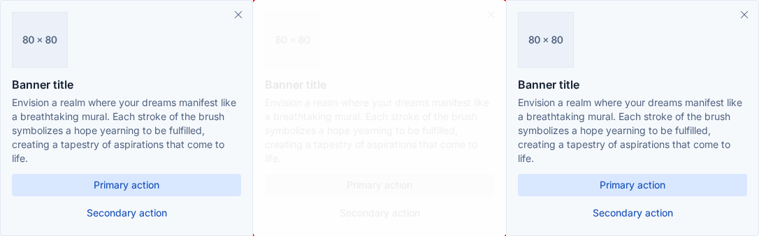
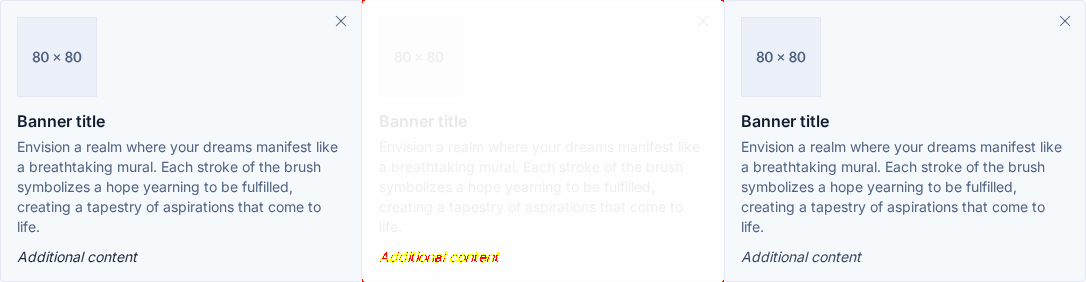
euibanner (12 differences)

StoryDiff %BeforeAfterDiff
container sizes desktop 59.55%
filled primary action desktop <0.01%
kitchen sink custom children desktop 0.12%
playground desktop <0.01%
with actions desktop <0.01%
with children desktop 0.12%
container sizes mobile 12.23%
filled primary action mobile 0.01%
kitchen sink custom children mobile 0.33%
playground mobile 0.02%
with actions mobile 0.01%
with children mobile 0.22%

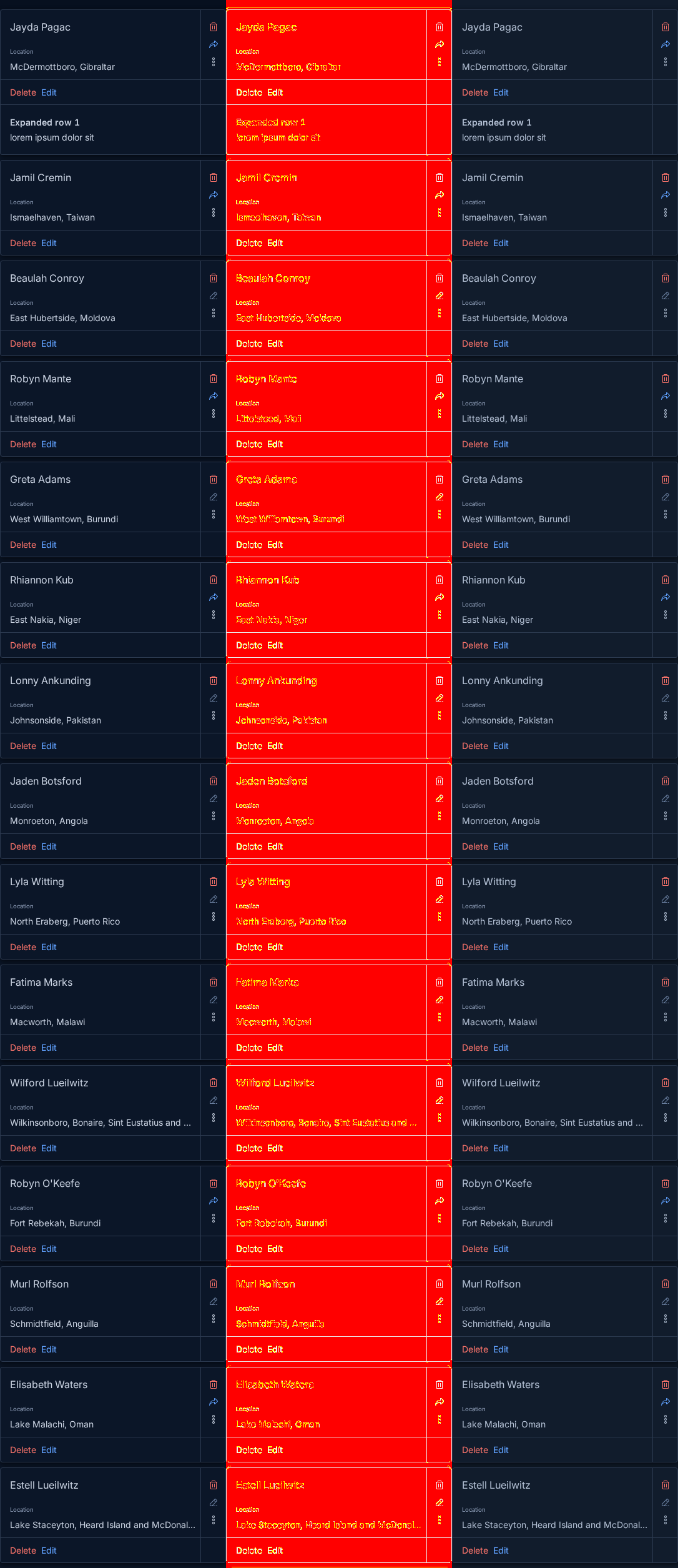
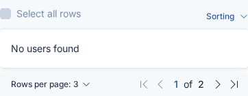
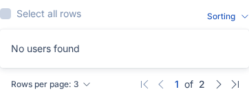
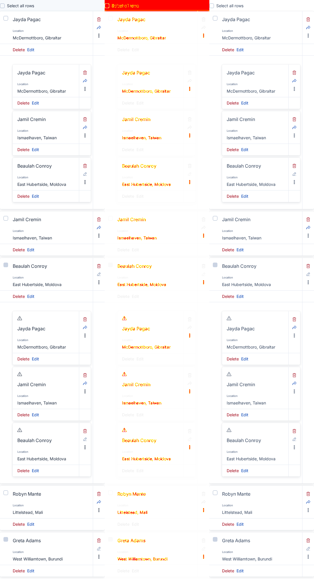
euibasictable (22 differences)

StoryDiff %BeforeAfterDiff
dark mode desktop 97.15%
empty table desktop 34.93%
expanded nested table desktop 1.09%
expanded nested table without background desktop 95.04%
expanded row desktop 1.07%
high contrast mobile desktop 0.86%
large expanded row desktop 18.71%
marked row desktop 20.97%
panelled desktop 1.07%
playground desktop 20.97%
scrollable desktop 6.87%
dark mode mobile 94.49%
empty table mobile 50.31%
expanded nested table mobile 2.71%
expanded nested table without background mobile 94.52%
expanded row mobile 1.58%
high contrast mobile mobile 1.60%
large expanded row mobile 9.34%
marked row mobile 13.33%
panelled mobile 3.80%
playground mobile 13.33%
scrollable mobile 6.93%

euibeacon (2 differences)

StoryDiff %BeforeAfterDiff
playground desktop 13.89%
playground mobile 13.89%

euibetabadge (4 differences)

StoryDiff %BeforeAfterDiff
playground desktop 18.08%
title alignment desktop 88.50%
playground mobile 18.08%
title alignment mobile 75.41%

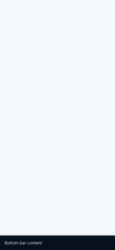
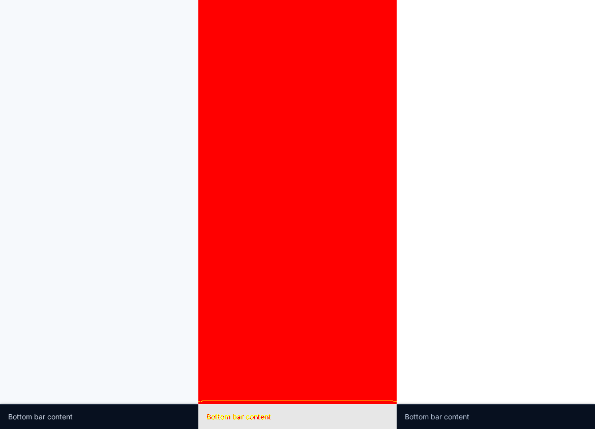
euibottombar (2 differences)

StoryDiff %BeforeAfterDiff
playground desktop 94.46%
playground mobile 94.14%

euibreadcrumbs (12 differences)

StoryDiff %BeforeAfterDiff
application dark mode desktop 65.14%
application desktop 65.14%
application high contrast dark desktop 64.21%
application high contrast desktop 64.19%
dark mode desktop 93.17%
playground desktop 93.02%
application dark mode mobile 68.87%
application high contrast dark mobile 65.53%
application high contrast mobile 65.50%
application mobile 68.87%
dark mode mobile 96.48%
playground mobile 96.28%

euibutton (2 differences)

StoryDiff %BeforeAfterDiff
high contrast desktop 75.83%
high contrast mobile 58.08%

euibuttonempty (2 differences)

StoryDiff %BeforeAfterDiff
playground desktop 90.69%
playground mobile 90.69%

euibuttongroup (38 differences)

StoryDiff %BeforeAfterDiff
disabled with tooltips desktop 99.82%
dividers desktop 85.70%
flex layout behavior desktop 67.89%
high contrast desktop 52.47%
icon only desktop 1.95%
kitchen sink desktop 86.98%
layout vertical desktop 97.87%
multi selection desktop 2.88%
partially disabled desktop 73.50%
segmented desktop 5.53%
segmented icon only desktop 90.39%

Table truncated - see the Buildkite annotation for the full diff.

@mgadewoll
mgadewoll force-pushed the calm-down/token-changes branch from 7e0c2c9 to 745e6da Compare September 1, 2026 10:54
@mgadewoll
mgadewoll force-pushed the calm-down/token-changes branch from 745e6da to 4599139 Compare September 1, 2026 10:58
@elastic-vault-github-plugin-prod

Copy link
Copy Markdown

📷 1071 visual difference(s) found

Look at the visual diff below. If everything is expected, run Approve visual changes to update baselines, re-run the job or make appropriate fixes.

See the visual regression testing wiki for more information.

Expand to review

euiaccordion (2 differences)

StoryDiff %BeforeAfterDiff
playground desktop 98.04%
playground mobile 92.37%

euiaspectratio (2 differences)

StoryDiff %BeforeAfterDiff
playground desktop 0.16%
playground mobile 0.49%

euiautorefresh (4 differences)

StoryDiff %BeforeAfterDiff
playground desktop 97.24%
playground desktop 91.65%
playground mobile 90.23%
playground mobile 91.65%

euiautosizer (2 differences)

StoryDiff %BeforeAfterDiff
playground desktop 0.02%
playground mobile 0.09%

euiavatar (2 differences)

StoryDiff %BeforeAfterDiff
playground desktop 16.41%
playground mobile 16.41%

euibadge (12 differences)

StoryDiff %BeforeAfterDiff
custom colors desktop 3.95%
dark mode desktop 83.35%
high contrast mode desktop 82.40%
kitchen sink desktop 82.36%
playground desktop 4.07%
playground desktop 10.17%
custom colors mobile 3.95%
dark mode mobile 58.29%
high contrast mode mobile 55.91%
kitchen sink mobile 55.81%
playground mobile 4.07%
playground mobile 10.17%

euibanner (12 differences)

StoryDiff %BeforeAfterDiff
container sizes desktop 59.55%
filled primary action desktop <0.01%
kitchen sink custom children desktop 0.12%
playground desktop <0.01%
with actions desktop <0.01%
with children desktop 0.12%
container sizes mobile 12.23%
filled primary action mobile 0.01%
kitchen sink custom children mobile 0.33%
playground mobile 0.02%
with actions mobile 0.01%
with children mobile 0.22%

euibasictable (22 differences)

StoryDiff %BeforeAfterDiff
dark mode desktop 97.15%
empty table desktop 34.93%
expanded nested table desktop 1.09%
expanded nested table without background desktop 95.04%
expanded row desktop 1.07%
high contrast mobile desktop 0.59%
large expanded row desktop 18.71%
marked row desktop 20.97%
panelled desktop 1.07%
playground desktop 20.97%
scrollable desktop 6.87%
dark mode mobile 94.49%
empty table mobile 50.31%
expanded nested table mobile 2.71%
expanded nested table without background mobile 94.52%
expanded row mobile 1.58%
high contrast mobile mobile 0.59%
large expanded row mobile 9.34%
marked row mobile 13.33%
panelled mobile 3.80%
playground mobile 13.33%
scrollable mobile 6.93%

euibeacon (2 differences)

StoryDiff %BeforeAfterDiff
playground desktop 13.89%
playground mobile 13.89%

euibetabadge (4 differences)

StoryDiff %BeforeAfterDiff
playground desktop 18.08%
title alignment desktop 88.50%
playground mobile 18.08%
title alignment mobile 75.41%

euibottombar (2 differences)

StoryDiff %BeforeAfterDiff
playground desktop 94.46%
playground mobile 94.14%

euibreadcrumbs (12 differences)

StoryDiff %BeforeAfterDiff
application dark mode desktop 65.14%
application desktop 65.14%
application high contrast dark desktop 64.21%
application high contrast desktop 64.19%
dark mode desktop 93.17%
playground desktop 93.02%
application dark mode mobile 68.87%
application high contrast dark mobile 65.53%
application high contrast mobile 65.50%
application mobile 68.87%
dark mode mobile 96.48%
playground mobile 96.28%

euibutton (2 differences)

StoryDiff %BeforeAfterDiff
high contrast desktop 75.83%
high contrast mobile 58.08%

euibuttonempty (2 differences)

StoryDiff %BeforeAfterDiff
playground desktop 90.69%
playground mobile 90.69%

euibuttongroup (38 differences)

StoryDiff %BeforeAfterDiff
disabled with tooltips desktop 99.71%
dividers desktop 85.70%
flex layout behavior desktop 67.89%
high contrast desktop 0.11%
icon only desktop 2.95%
kitchen sink desktop 86.95%
layout vertical desktop 97.87%
multi selection desktop 4.02%
partially disabled desktop 73.50%
segmented desktop 5.53%
segmented icon only desktop 90.39%

Table truncated - see the Buildkite annotation for the full diff.

@mgadewoll

Copy link
Copy Markdown
Contributor Author

buildkite test this

@elastic-vault-github-plugin-prod

Copy link
Copy Markdown

📷 1071 visual difference(s) found

Look at the visual diff below. If everything is expected, run Approve visual changes to update baselines, re-run the job or make appropriate fixes.

See the visual regression testing wiki for more information.

Expand to review

euiaccordion (2 differences)

StoryDiff %BeforeAfterDiff
playground desktop 98.04%
playground mobile 92.37%

euiaspectratio (2 differences)

StoryDiff %BeforeAfterDiff
playground desktop 0.16%
playground mobile 0.49%

euiautorefresh (4 differences)

StoryDiff %BeforeAfterDiff
playground desktop 97.24%
playground desktop 91.65%
playground mobile 90.23%
playground mobile 91.65%

euiautosizer (2 differences)

StoryDiff %BeforeAfterDiff
playground desktop 0.02%
playground mobile 0.09%

euiavatar (2 differences)

StoryDiff %BeforeAfterDiff
playground desktop 16.41%
playground mobile 16.41%

euibadge (12 differences)

StoryDiff %BeforeAfterDiff
custom colors desktop 3.95%
dark mode desktop 83.35%
high contrast mode desktop 82.40%
kitchen sink desktop 82.36%
playground desktop 4.07%
playground desktop 10.17%
custom colors mobile 3.95%
dark mode mobile 58.29%
high contrast mode mobile 55.91%
kitchen sink mobile 55.81%
playground mobile 4.07%
playground mobile 10.17%

euibanner (12 differences)

StoryDiff %BeforeAfterDiff
container sizes desktop 59.55%
filled primary action desktop <0.01%
kitchen sink custom children desktop 0.12%
playground desktop <0.01%
with actions desktop <0.01%
with children desktop 0.12%
container sizes mobile 12.23%
filled primary action mobile 0.01%
kitchen sink custom children mobile 0.33%
playground mobile 0.02%
with actions mobile 0.01%
with children mobile 0.22%

euibasictable (22 differences)

StoryDiff %BeforeAfterDiff
dark mode desktop 97.15%
empty table desktop 34.93%
expanded nested table desktop 1.09%
expanded nested table without background desktop 95.04%
expanded row desktop 1.07%
high contrast mobile desktop 0.59%
large expanded row desktop 18.71%
marked row desktop 20.97%
panelled desktop 1.07%
playground desktop 20.97%
scrollable desktop 6.87%
dark mode mobile 94.49%
empty table mobile 50.31%
expanded nested table mobile 2.71%
expanded nested table without background mobile 94.52%
expanded row mobile 1.58%
high contrast mobile mobile 0.59%
large expanded row mobile 9.34%
marked row mobile 13.33%
panelled mobile 3.80%
playground mobile 13.33%
scrollable mobile 6.93%

euibeacon (2 differences)

StoryDiff %BeforeAfterDiff
playground desktop 13.89%
playground mobile 13.89%

euibetabadge (4 differences)

StoryDiff %BeforeAfterDiff
playground desktop 18.08%
title alignment desktop 88.50%
playground mobile 18.08%
title alignment mobile 75.41%

euibottombar (2 differences)

StoryDiff %BeforeAfterDiff
playground desktop 94.46%
playground mobile 94.14%

euibreadcrumbs (12 differences)

StoryDiff %BeforeAfterDiff
application dark mode desktop 65.14%
application desktop 65.14%
application high contrast dark desktop 64.21%
application high contrast desktop 64.19%
dark mode desktop 93.17%
playground desktop 93.02%
application dark mode mobile 68.87%
application high contrast dark mobile 65.53%
application high contrast mobile 65.50%
application mobile 68.87%
dark mode mobile 96.48%
playground mobile 96.28%

euibutton (2 differences)

StoryDiff %BeforeAfterDiff
high contrast desktop 75.83%
high contrast mobile 58.08%

euibuttonempty (2 differences)

StoryDiff %BeforeAfterDiff
playground desktop 90.69%
playground mobile 90.69%

euibuttongroup (38 differences)

StoryDiff %BeforeAfterDiff
disabled with tooltips desktop 99.71%
dividers desktop 85.70%
flex layout behavior desktop 67.89%
high contrast desktop 0.11%
icon only desktop 2.95%
kitchen sink desktop 86.95%
layout vertical desktop 97.87%
multi selection desktop 4.02%
partially disabled desktop 73.50%
segmented desktop 5.53%
segmented icon only desktop 90.39%

Table truncated - see the Buildkite annotation for the full diff.

@mgadewoll
mgadewoll marked this pull request as ready for review September 1, 2026 15:19
@mgadewoll
mgadewoll requested a review from a team as a code owner September 1, 2026 15:19
@mgadewoll
mgadewoll requested a lite review from Copilot September 1, 2026 15:19

Copilot AI left a comment

Copy link
Copy Markdown
Contributor

Choose a reason for hiding this comment

The reason will be displayed to describe this comment to others. Learn more.

🟡 Changes recommended

The new font.title.letterSpacing token is documented as a title default but is not currently applied by EuiTitle’s Emotion styling and is typed as optional, creating inconsistent/undefined behavior.

Once you've addressed the issues Copilot identified, you can request another Copilot review.

Pull request overview

This PR is part of the calm-down redesign feature work and updates EUI’s theme token foundation (primarily Borealis) by introducing a recessed surface token, adding semantic border radius tiers, and adjusting key text/background color tokens (with HCM overrides), along with associated docs, snapshots, and changelogs.

Changes:

  • Added colors.backgroundBaseRecessed and documented it in token tables.
  • Added semantic border.radius.{inline,control,panel,frame} tokens and deprecated legacy small/medium.
  • Added font.title.letterSpacing and updated text/background token values (incl. HCM overrides to retain prior contrast).
File summaries
File Description
packages/website/docs/getting-started/theming/tokens/typography/preview_font_settings.tsx Adds previews for title weight and letter-spacing tokens
packages/website/docs/getting-started/theming/tokens/typography/font-settings.mdx Documents new title-related typography tokens
packages/website/docs/getting-started/theming/tokens/colors/background_colors_table.tsx Adds backgroundBaseRecessed to docs table; fixes a token label
packages/website/docs/getting-started/theming/tokens/borders/index.mdx Updates border radius guidance toward semantic tokens
packages/website/docs/getting-started/theming/tokens/borders/border_radii_table.tsx Adds semantic radius tokens to the radii table
packages/release-cli/kibana-prep-commits Adds Kibana prep commit references for integration
packages/eui/src/services/theme/snapshots/provider.test.tsx.snap Updates snapshots impacted by theme/CSS output changes
packages/eui/src/global_styling/mixins/snapshots/_button.test.ts.snap Updates button mixin snapshots for new text colors
packages/eui/src/components/text/snapshots/text.styles.test.ts.snap Updates text style snapshots for new text token values
packages/eui/src/components/form/form.styles.test.tsx Updates form style expectations for new colors/backgrounds
packages/eui/src/components/collapsible_nav/collapsible_nav_group/snapshots/collapsible_nav_group.test.tsx.snap Updates snapshots impacted by styling output changes
packages/eui/changelogs/upcoming/9968.md Adds changelog entry for the token updates and deprecations
packages/eui/.storybook/decorator.tsx Aligns Storybook iframe background with theme surface tokens
packages/eui-theme-common/src/global_styling/variables/typography.ts Extends theme typings with title letter-spacing
packages/eui-theme-common/src/global_styling/variables/colors.ts Adds backgroundBaseRecessed to background color typings
packages/eui-theme-common/src/global_styling/variables/borders.ts Adds semantic radius typings; marks small/medium deprecated
packages/eui-theme-common/changelogs/upcoming/9968.md Changelog for new theme-common typings and deprecations
packages/eui-theme-borealis/src/variables/colors/_colors_light.ts Updates light mode text/body/background tokens; adds recessed surface
packages/eui-theme-borealis/src/variables/colors/_colors_light.scss Updates SCSS variables for light mode (incl. recessed + body)
packages/eui-theme-borealis/src/variables/colors/_colors_dark.ts Updates dark mode text/background tokens; adds recessed surface
packages/eui-theme-borealis/src/variables/colors/_colors_dark.scss Updates SCSS variables for dark mode (incl. recessed + emptyShade)
packages/eui-theme-borealis/src/variables/_typography.ts Adds font.title.letterSpacing to Borealis theme
packages/eui-theme-borealis/src/variables/_typography.scss Adds letter-spacing into SCSS title maps across sizes
packages/eui-theme-borealis/src/variables/_overrides.ts Adds HCM overrides for text and textParagraph contrast
packages/eui-theme-borealis/src/variables/_borders.ts Adds semantic radii values to Borealis theme
packages/eui-theme-borealis/src/variables/_borders.scss Adds SCSS semantic radius variables
packages/eui-theme-borealis/src/eui_theme_borealis_light.json.d.ts Updates generated JSON typings for new tokens
packages/eui-theme-borealis/src/eui_theme_borealis_light.json Updates generated light JSON tokens (colors/radii)
packages/eui-theme-borealis/src/eui_theme_borealis_dark.json.d.ts Updates generated JSON typings for new tokens
packages/eui-theme-borealis/src/eui_theme_borealis_dark.json Updates generated dark JSON tokens (colors/radii)
packages/eui-theme-borealis/changelogs/upcoming/9968.md Adds Borealis changelog entry for token updates/deprecations
Review details
  • Files reviewed: 17/1102 changed files
  • Comments generated: 4
  • Review effort level: Lite

💡 Add a code-review agent skill or configure MCP servers for context-aware, tailored reviews. Learn more in the docs.

Comment thread packages/eui-theme-common/src/global_styling/variables/typography.ts Outdated
Comment thread packages/website/docs/getting-started/theming/tokens/borders/index.mdx Outdated
@infra-vault-gh-plugin-prod

Copy link
Copy Markdown

💚 Build Succeeded

History

cc @mgadewoll

@weronikaolejniczak weronikaolejniczak left a comment

Copy link
Copy Markdown
Contributor

Choose a reason for hiding this comment

The reason will be displayed to describe this comment to others. Learn more.

Found some blocking changes as well as some nits but overall tested and it looks good 👍🏻

It is a good battle test for the VRT 😄 (which they failed)


nit:

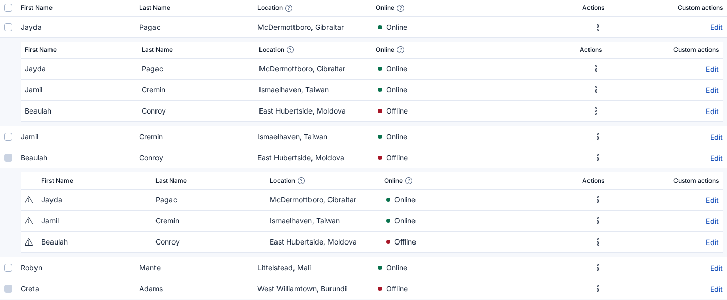
Image

I think this needs changing, right? packages/website/docs/getting-started/theming/tokens/colors/special_colors_table.tsx

Copy link
Copy Markdown
Contributor

Choose a reason for hiding this comment

The reason will be displayed to describe this comment to others. Learn more.

blocking: I think we're missing an update to shade130 -> euiColorShade110 (light) and shade30 -> euiColorShade40 (dark)? Only in the Sass files, JS layer is 🆗

Maybe semi-blocking because who gives a.. about Sass

Copy link
Copy Markdown
Contributor Author

Choose a reason for hiding this comment

The reason will be displayed to describe this comment to others. Learn more.

Good catch, I missed those. This manual workflow is really error prone 🫠
Updated in 2d76cc3

Comment on lines +11 to +12
https://github.com/elastic/kibana/pull/288032/commits/8ce9406a13f21821ae7c74ab48bc798299a242a4
https://github.com/elastic/kibana/pull/288032/commits/5a4fbee09edf651ff604ed961198a1addeb302a2

Copy link
Copy Markdown
Contributor

Choose a reason for hiding this comment

The reason will be displayed to describe this comment to others. Learn more.

no action required: thanks for running this against Kibana already and prepping the changes 😄

Copy link
Copy Markdown
Contributor

Choose a reason for hiding this comment

The reason will be displayed to describe this comment to others. Learn more.

nit: I don't think we need to wrap with Global, do we? It just needs to be under the provider. So this could be simplified to:

<EuiProvider>
  <Global />
  <div id="story-wrapper" ref={setPortalSibling} css={writingModeCss}>
    {portalInsert && children}
  </div>
</EuiProvider>

This way is also okay, it's just slightly more verbose for no value?

Copy link
Copy Markdown
Contributor Author

Choose a reason for hiding this comment

The reason will be displayed to describe this comment to others. Learn more.

Sure we can make it a bit simpler by not wrapping the content 👍
Updated in 0fd90d3

Comment on lines 119 to 122
"euiPanelBorderRadiusModifiers": {
"borderRadiusNone": 0,
"borderRadiusMedium": "4px"
"borderRadiusMedium": "12px"
},

Copy link
Copy Markdown
Contributor

Choose a reason for hiding this comment

The reason will be displayed to describe this comment to others. Learn more.

blocking: Hmmm TS and Sass add the tokens but JSON also changes the old tokens on top of that. I don't think this is expected, right?

euiFormControlBorderRadius as well.

Copy link
Copy Markdown
Contributor Author

Choose a reason for hiding this comment

The reason will be displayed to describe this comment to others. Learn more.

You're right, I merged too many things too early 🫠 We're not actually using the new tokens yet so the inherited values shouldn't be updated yet.
Reverted in 2d76cc3

Copy link
Copy Markdown
Contributor

Choose a reason for hiding this comment

The reason will be displayed to describe this comment to others. Learn more.

blocking: We need to apply the letter spacing change to JSON as well, no?

Copy link
Copy Markdown
Contributor Author

Choose a reason for hiding this comment

The reason will be displayed to describe this comment to others. Learn more.

Yes, absolutely. Thanks for the catch!
Added in 2d76cc3

Comment thread packages/eui-theme-common/changelogs/upcoming/9968.md Outdated

Copy link
Copy Markdown
Contributor

Choose a reason for hiding this comment

The reason will be displayed to describe this comment to others. Learn more.

doubt: Should we mention the HCM override?

Copy link
Copy Markdown
Contributor Author

Choose a reason for hiding this comment

The reason will be displayed to describe this comment to others. Learn more.

My thinking here was that HCM keeps the previous state so it wouldn't be a change that needs mentioning? 🤔
But I don't mind adding it if you think it's valueable.

Copy link
Copy Markdown
Contributor

Choose a reason for hiding this comment

The reason will be displayed to describe this comment to others. Learn more.

Hmmmm I guess you're right, nothing changes in that regard, I was just thinking this might influence the contrast and for consumers to be aware 🤔

Let's leave it as is


export interface _EuiThemeBorderRadiusValues {
/**
* @deprecated - use a semantic token instead (e.g. `inline`, `control` or `panel`)

Copy link
Copy Markdown
Contributor

Choose a reason for hiding this comment

The reason will be displayed to describe this comment to others. Learn more.

nit: Missing frame? Same below.

Copy link
Copy Markdown
Contributor Author

Choose a reason for hiding this comment

The reason will be displayed to describe this comment to others. Learn more.

I kinda did it on purpose because frame is the one that should be used the least. But I guess for correctness we should add it anyway.
Updated in fd60056

@infra-vault-gh-plugin-prod

Copy link
Copy Markdown

💚 Build Succeeded

History

cc @mgadewoll

Sign up for free to join this conversation on GitHub. Already have an account? Sign in to comment

Projects

None yet

Development

Successfully merging this pull request may close these issues.

5 participants